Another Take on Corraini Workshop
In 1973 the Corraini’s founded an art gallery in Mantova where they designed for their exhibitions a series of catalogues created from the artist’s point of view. There are two parts of the publishing house, an art gallery and a design and publishing center. To date they have 3 books stores, two in Milan and one in Bologna. They joked about expanding to New York; we would only be so lucky.
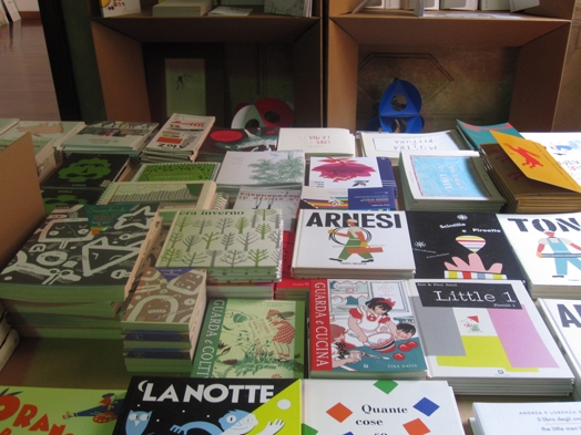
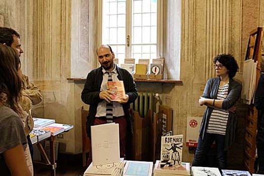
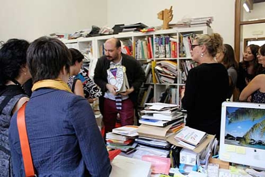
They publish books made by artist in different fields, graphic design, visual arts, architecture and others. Artists come to Corraini with a project and work with the team there to change and complete their book where they may select the paper, binding and sometimes even deepen the concept. They see what they are making as something more than just the book, it’s an idea archive. There is a great entrepreneurial characteristic to the enterprise making it an important stop for a program titled “Designer as Entrepreneur.”
We had an informative talk from Chiara Medioli, the Marketing Director from Fabriano papers focused on paper types. They have some 3000 codes of paper types. The two macro families are those made for 2D use and the heavier, stronger papers made for 3D boxes, shopping bags and other packaging. When selecting paper types, there is smooth, textured, colored paper that is dyed at the pulp stage and coated paper. Coated paper is cheaper because there is less pulp. The coating is made of crushed stone. The more pulp content the more expensive the paper. There is also a large selection of papers with special effects like embossed, translucent and marble types.
One must consider if you will be printing offset with toner based inks or indigo digital printing with electro charged ink. Then thinking beyond the aesthetic aspects of paper you need to consider the function for cover, end papers and the block. The end papers work the hardest and a careful choice is required for the enduring book. The largest supply of pulp comes from Chile, therefore a lot of books were published in coated paper last year because of the earthquakes, making pulp suddenly scarce. Finally the Rolls Royce of paper and most durable is made of cotton. The more cotton content the more opaque the paper, used for money, framing mounts or very high end editions of books. Up to the 18th century there was only cotton and linen, before the larger demand for print was established.
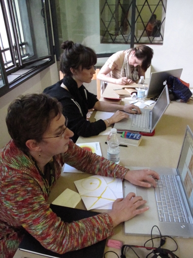
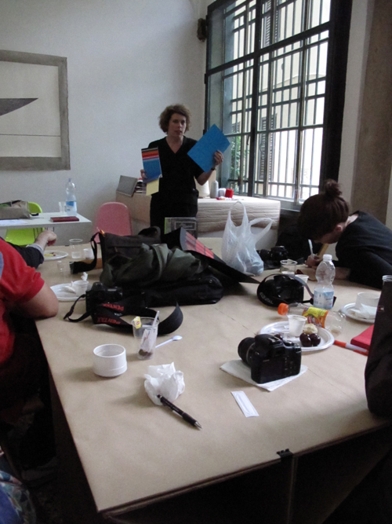
After all of that we began the workshop to produce a book of our own. Pietro encouraged us to think of the book in relation to the 4th wall. The idea of breaking the fourth wall of the box or stage and bring the audience inside the book. Like Mantegna’s famous ceiling fresco where the viewer has the sensation of being inside the painting, this point of view can be used in book design. Our books where made of 2 signatures of 16 pages in which each page is viewed front and back rather than only as flat spreads. One can let the viewer know immediately that there is the next page. I produced the “book of breath” in Mantova, where with the simple idea was to be aware of your breath as you turn each page breathing in page one, out page two, and so on. It used imagery from the Sun inspired by Bruno Munari’s “drawing the sun” and using my own paintings that I call “Sun Portraits.” So if the book was the sun, then the reader is breathing with it. It’s cover title is “I am the Sun and the Sun is Me.”
We managed to produce and print 15 unique books in which Pietro designed red covers for all of them, with Name, Title and published by Corraini Edizzioni in Montova to take home with us for our libraries. What a privilege and what a delicious day of using our senses.