Meet the Class of 2011
Meet: Andrew Schaff
From: New York
Design Specialty: Type & Photo
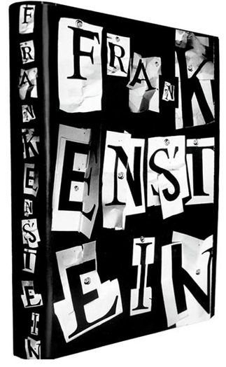
Favorite work: “Frankenstein” book jacket and interior design. When I approached this book jacket, I knew I wanted to surprise the audience with a design solution that was unexpected, yet transparent in its communication. The finished design excites me because it is one of my best marriages between concept and execution. The book interior used Trade Gothic and Hoefler Text throughout, so it made sense for me to use a type treatment that combined these two faces. In the end, I printed out each letter of “Frankenstein” in both typefaces, cut them up, and put them back together to create a rather unsettling visual layout. A “Frankenstein-ing” of the typefaces, poorly put back together, like the subject of the novel. Photographing each letter composition individually, and then assembing the final layout was also useful to create the feeling of discomfort, because the shadows created on each letterform are not from the same direction of light. Unsettling and exciting!