
Best Design of the Decade Goes To . . .
The IDSA’s “Design of the Decade” was announced the other day. Here is their statement:
“After thorough evaluation of all of the entrants for the 2010 Designs of the Decade competition, ClearRx was the unanimous choice of the jury. There was complete alignment around the aesthetic, functional and societal benefits of the product. ClearRx is an elegant design solution helping millions of users, and Target is to be commended for helping to bring such a thoughtful, well designed solution to the marketplace.”
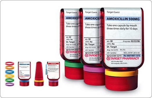
ClearRx is the outcome of Deborah Adler’s (MFAD ’03) thesis project: The Target prescription drug bottle.
IDSA’s Design of the Decade (DoD), sponsored by Teague, recognizes and celebrates the positive impact that design has on business and society. The DoD jury, led by Charles L. Jones, FIDSA awarded 12 golds, six silvers and two bronzes in 12 categories.
The designs were judged on their benefit to society, benefit to business, innovation, benefit to user, responsibility, benefit to client and visual appeal.
ClearRx, a D-shaped bottle, addresses the communication, packaging and system deficiencies encountered by users of maintenance drugs, including the elderly. It provides a solution that can reduce potential risks associated with taking medications.