Meet the Class of 2011
Meet: Karin Soukup
From: Chicago via St. Louis
Design “Specialty”:
print design (multi-page formats); conceptual/lateral thinking; production techniques (letterpress, photography, wood, metal, etc.)
Why grad school:
I felt that I was at a place to be pushed beyond my comfort levels and wanted to learn more about the history and the context of design as well as how it applies to my process
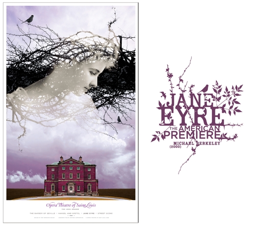
Favorite work:
I worked on a series of theatre posters for Opera Theatre in Saint Louis while working for TOKY Branding + Design a number of years ago. The poster and show logotype for the production of ‘Jane Eyre’ resonate with because of simultaneously delicate and severe approach to the typography and imagery. Something about straddling that ambiguous grey zone of dissonance really speaks well to the eeriness of the story itself, and provides a subtle sense of drama that is quite appealing to me.