
Meet the Class of 2015: Issa Mao
Issa Mao creates different layers of meaning with her designs, whether conceptually or aesthetically. “I try to look at every aspect of each project so I can put detail and thought into everything I design,” she says. “So, when assigned the task to design a typeface based on an individual’s character and personality, I first thoroughly researched my subject, jewelry designer Kokichi Mikimoto. Only by first understanding the context completely could I hope for success. ”
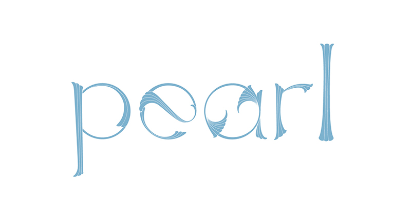
“I learned Mikimoto’s style evokes a skillful blend of European Art Nouveau with traditional Japanese craft, using shell-like forms, sleek curves, and geometric patterns while paying homage to the ultimate symbol of purity, grace, and natural elegance: the Mikimoto pearl. I wanted to create something equally elegant, and without relying on decorative elements; a typeface reflecting Mikimoto, but avoiding dramatic metaphorical conceits.”
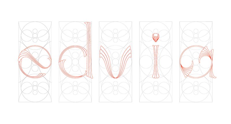
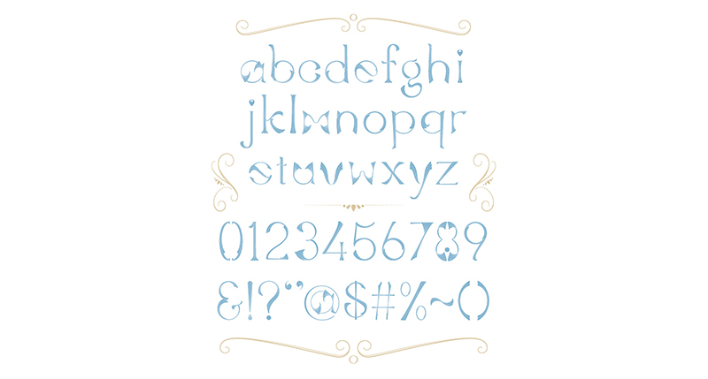
“For my final design, I created an alphabet based on an Art Nouveau geometric framework of multiple basic elements, carefully placed to ensure stylistic consistency while enabling a variety of forms. Within this framework, I used simple, sweeping lines to develop organic, individual letterforms. This resulted in a unified family of sophisticated characters, each unique and simple as a pearl, creating a typeface which spoke to Mikimoto’s personality, using my own design voice.”