Roma Day 3: Zennaro Talks Type
By Lori Young
Today’s lecture was a wonderful overview of the evolution of Rome type from various points in time and started with antiquity and Latin letters. Various examples showed that the master carvers would emulate the brush style in their carvings. Color was added to the inscriptions, particularly red, but faded with time. Mauro explained letters of antiquity were condensed because the walls were covered with text; advertising, graffiti, and news of the day. (image from 1930, wall fragment, Pompeii.) He enjoyed this history and type so much that he developed a type face called: Pompei. A beautiful typeface, but not available online however Mauro’s other typeface Farfa is listed with MyFonts.com.
Mauro showed examples of shortened abbreviated text and added the he thought perhaps this was a form of personal writing. (unfortunately, I can’t add more context here, I left the room for a minute) Text on papyrus mimicked the manner of speaking, a continuous line of words, though the physical form of the letters changed with Christian Emperor Constantine (325 A.D) becoming more bulbous. Some lowercase letters and leading appeared. The rule of Holy Roman Emperor Charlemagne (9th century) over vast territories helped to increase the demand for writing (scriptural) and more localized styles of writing emerged. The Carolingian minuscule writing was developed and apparently, the official court “hand.”
The evolution of the ampersand emerged from the word “and” or “et” as somewhat of a ligature combined the “S” like form of the “e” from ______ (and where this letterform comes from is not in my notes L) He explained the logic behind the Greek numeral letters and to the everyone’s delight explained that D for 500 came from removing the left side of the Greek letter Fi for 1000 and that the V for 5 came from removing the bottom part of the X for ten.
Mauro went on to discuss the dense Black lettering and the assembly-line process that was set up to standardize writing and accommodate the high demand for written material in 11th c. After Guttenberg’s invention, typography evolved into a lighter style. He mentions Aldus, but I believe he used the phrase “In aedibus Aldi” for Aldus & Company? Explaining that the business of book buying and making had changed and that type needed to evolve. Aldus & Co developed many typefaces, notably an italic, and his printed work allowed for horizontal and vertical spacing creating easier reading. He also made small books for easy transportation.
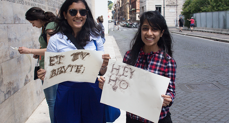
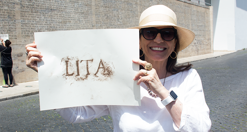
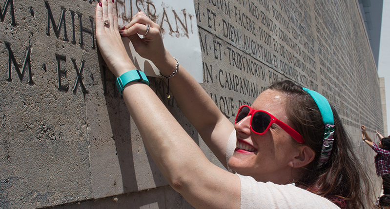
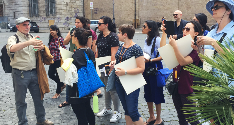
Later the class left with Mauro to visit the “Alter of Peace.” Here participants took a variety of rubbings from the enormous tablature. Later we walked around the corner to a building that showed two examples of radicalist and fascist architecture. (I asked Mauro to explain Radicalist architecture and he said “Think Bauhaus”) He pointed out two reliefs as examples of different ways to write Latin: one from the church for the soul, and one from the government for the body