Workshop Day 2: Whirlwind History
By Amy Rumbarger
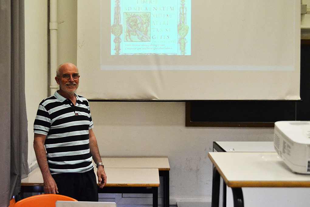
I’ve learned about type history in classes before, but not like Mauro Zennaro tells it. The first image he showed us was a striking juxtaposition: a plaque engraved with elegant Roman capitals—made for the Pope in the 15th century—sprayed over in 1970s red feminist graffiti reading, “Aborto Libero,” or “Free Abortion.” That gave us some indication of the astounding breadth of type history we’d be in for over the next few hours, and historical context that would come with it.
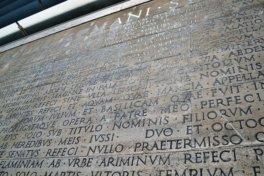
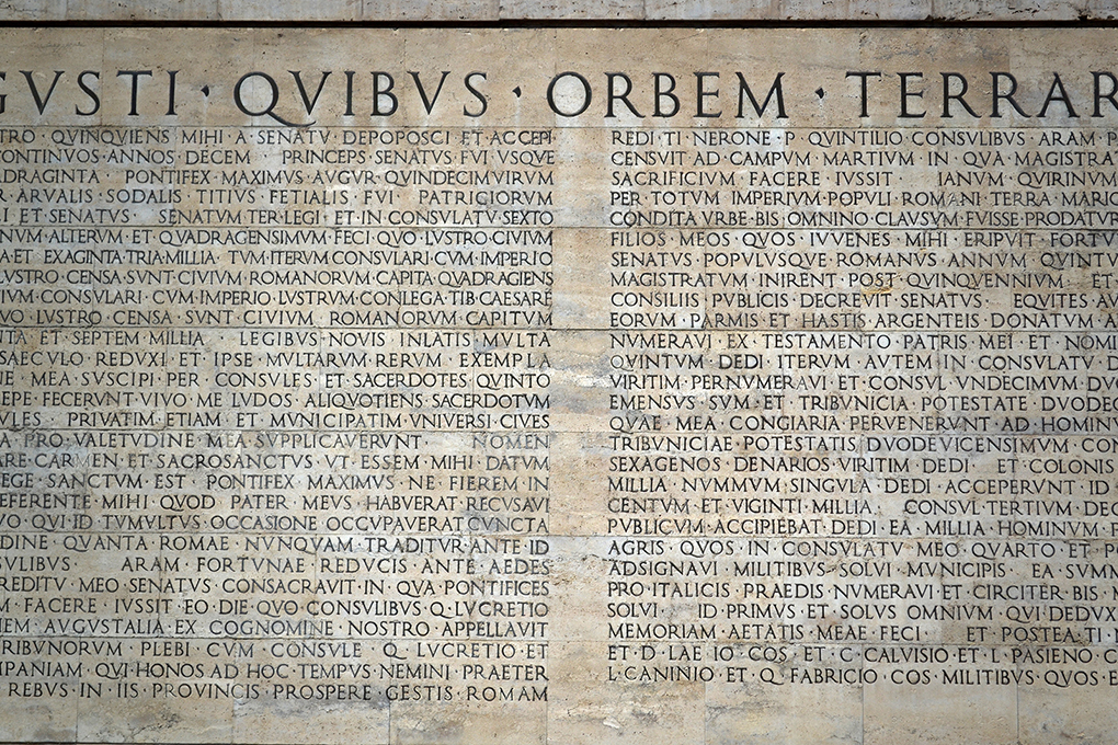
We started all the way back with how writing began, although Mauro said we can’t be sure who was the first to write. “Writing is something magical,” he said—it’s too ancient and powerful, so many believed it must have been a gift from the gods. Roman capitals are the foundation for all Western writing, and were first written with a flat brush by the very first “graphic designers,” and would then be traced into stone. Because of this, inscriptions were expensive and time consuming, so they had to be “sponsored”; many original inscriptions in Roman cities were used as advertising.
We think of Roman capitals as being very stately and official, but everyday writing was very different than these costly inscriptions. Commoners would often write with a nail on a slate, so they used a kind of shorthand for Latin that is essentially unreadable to us today, but allowed them to write faster with these crude tools—and it certainly looks nothing like refined Roman capitals.
From the lettering of the Roman Empire, we flew through the Middle Ages and learned how Carolingian and Blackletter scripts evolved from early rounded Christian writing, which in turn evolved from Greek letterforms. “Letters evolve like life,” Mauro observed as he compared the evolution of writing to Darwinism. He gave us an incredible look at the historical and societal changes that caused writing to transform from one style to another. Despite all the evolutions in style and language across Europe, it’s difficult to tell a 15th century inscription from a 20th century inscription in Rome because of the consistency of Roman capitals through the centuries.
After looking at centuries of writing, we finally arrived at the rise of typography and the printing press. Interestingly, when standardized books first arrived on the scene, space was money—so they used abbreviations much like we do today in texts or on Twitter. Mauro made other connections from ancient type to modern day, like how the Coca-Cola logo is written in Italian Baroque style script.
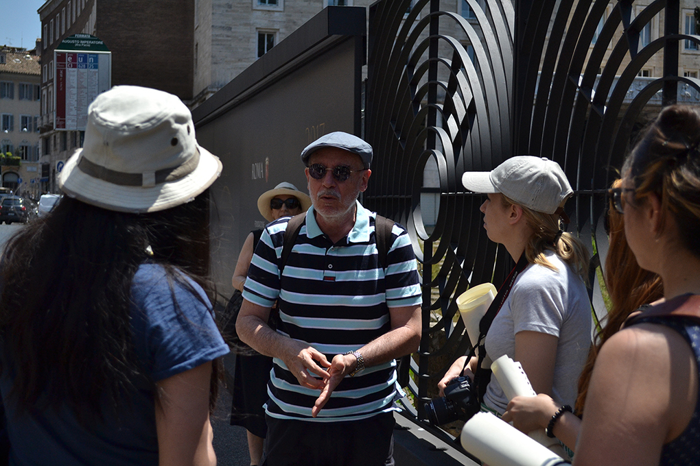
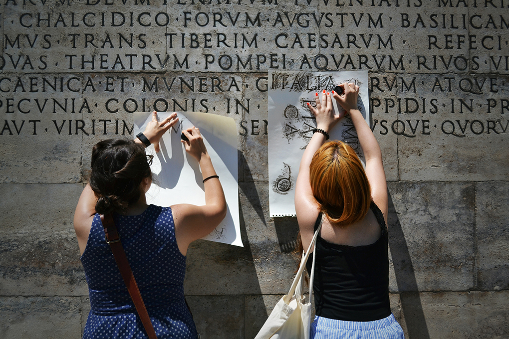
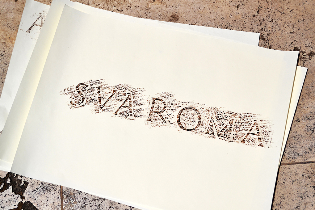
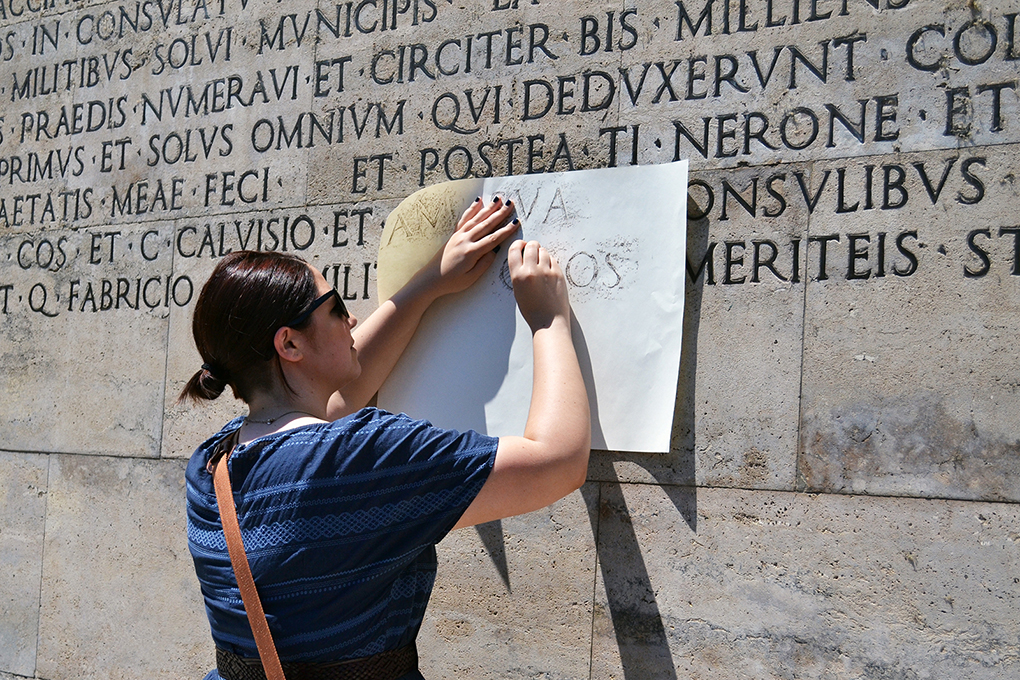
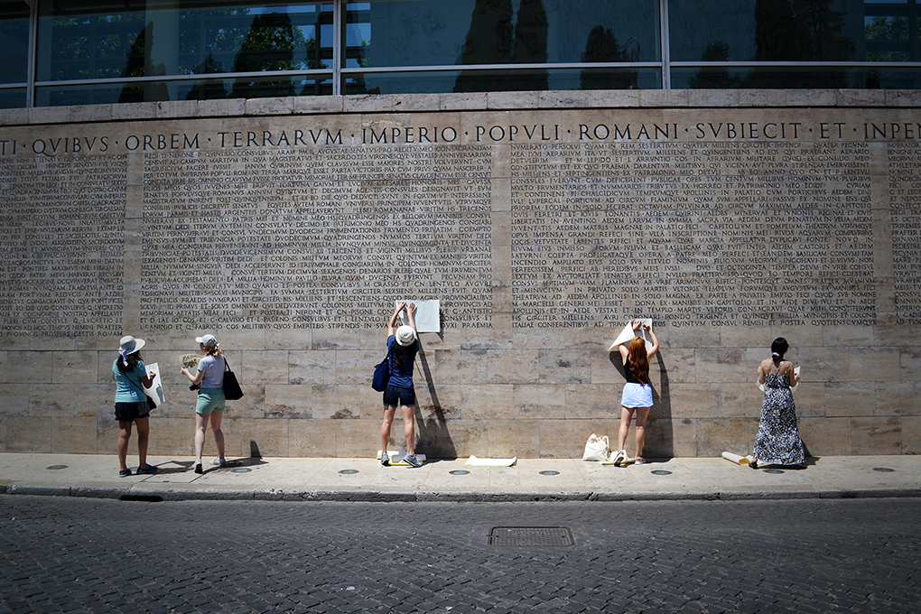
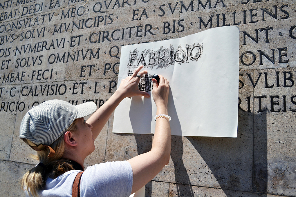
Post-whirlwind history lesson, we ventured out into the midday heat to do wax rubbings on a wall of classic Roman capitals, with a new appreciation of how those letters came to be. We attracted quite the crowd of observers—and even one passerby-turned-participant. Perhaps we influenced some newly minted type nerds.