Workshop Day 5: Lettering Composition
By Melissa Boucher
“Don’t be afraid of simplicity,” James Clough said, as we each narrowed in on letter design choices in the morning. Using an enlarged page of Aldus Manutius’ De Aetna from 1496 as a reference, we had derived our letter proportions from this Renaissance typeface Bembo and then infused our own styles into the letters. We were bursting with ideas, and it was easy to let our lettering work get a bit pastiche by mixing too much at once. James guided us to edit ruthlessly.
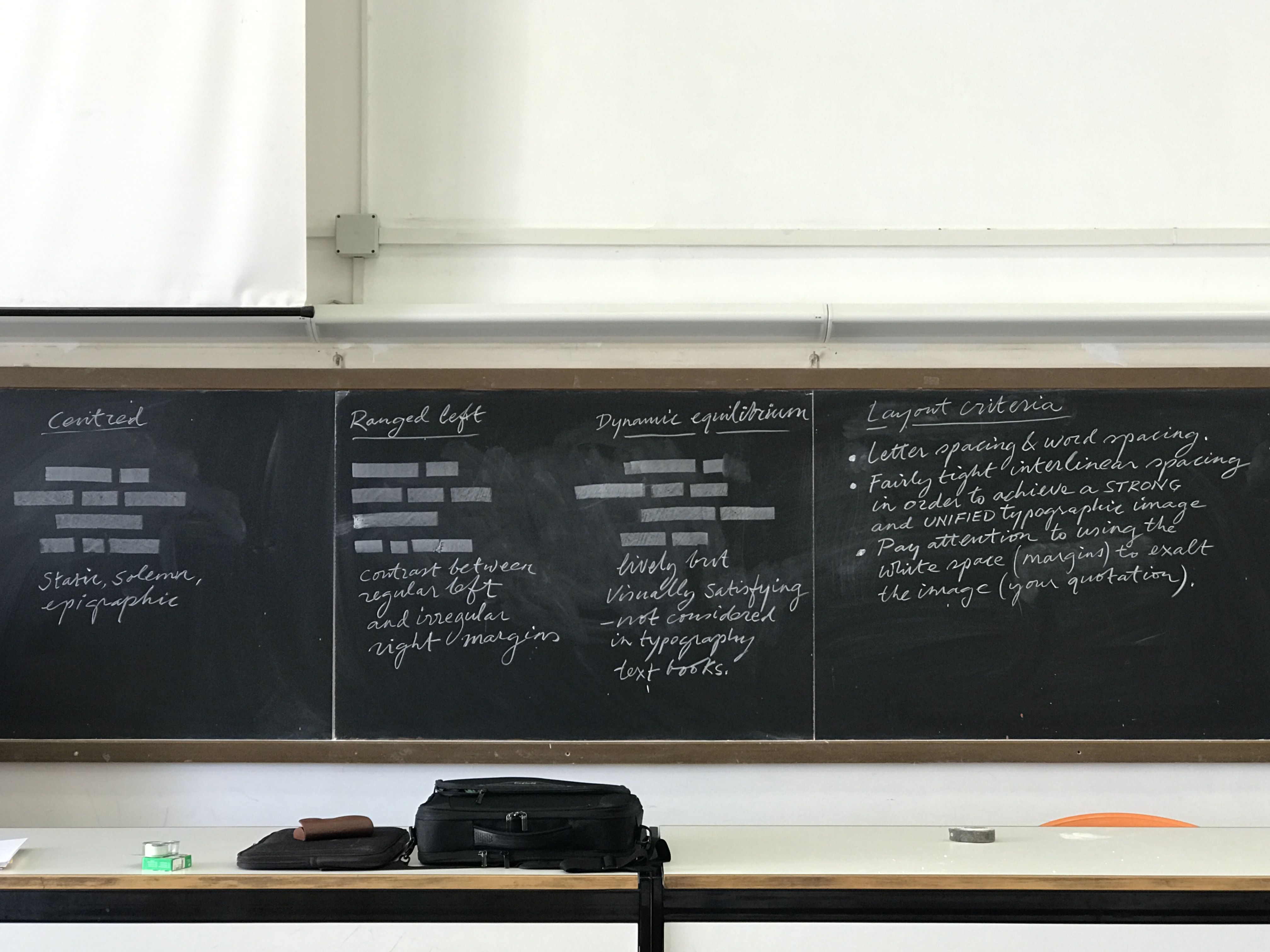
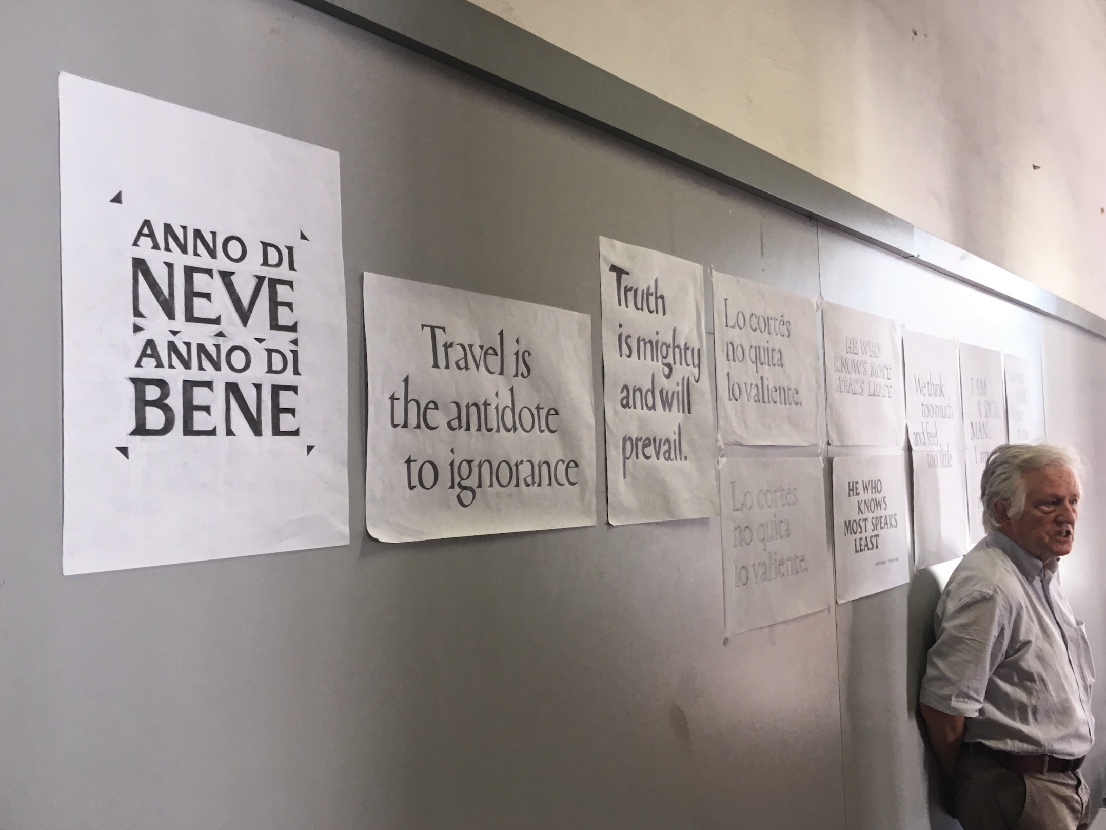
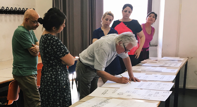
All morning and afternoon, we drew some letters, furrowed our brows, and redrew those letters. Eventually we moved to form compositions with a quote or phrase of our choice, focusing on spacing letters and arranging words to achieve a single coherent image. (In the meantime, I also got a free lesson on sharpening my 3B pencil with a razor knife, which is James’ preferred method.)
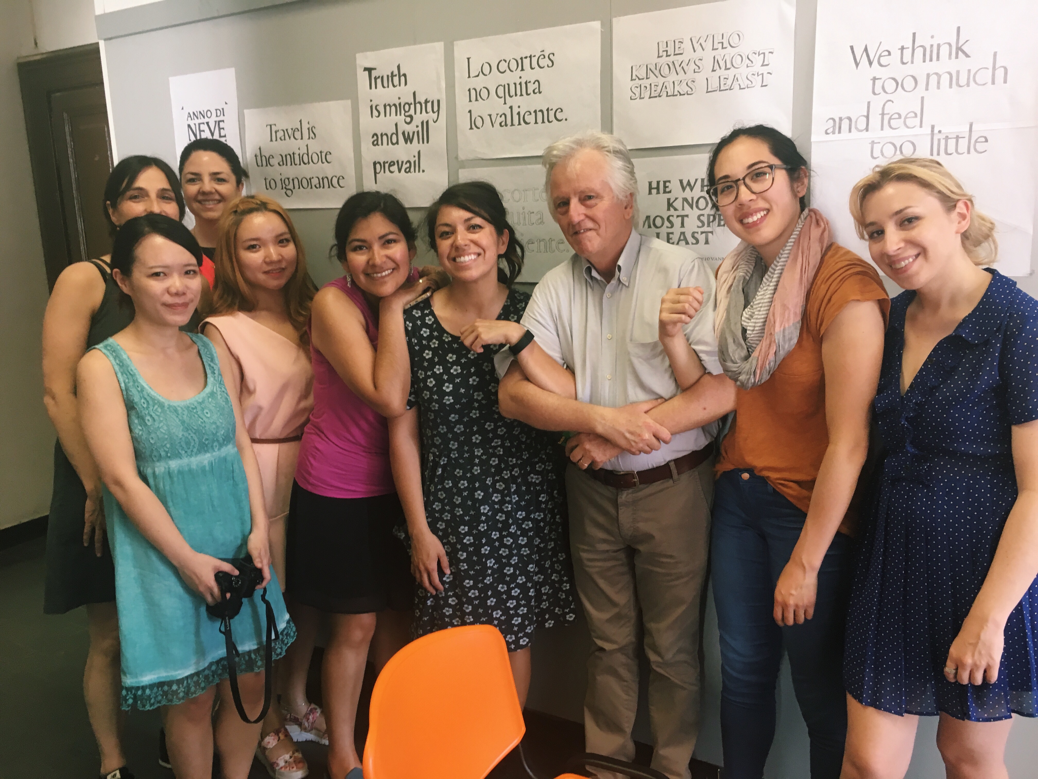
Our hands smeared with graphite, we emerged from pools of sweat at the end of a sweltering summer afternoon (33°C/91°F) with a beautifully diverse array of quote illustrations, each with unique emotion. Over the course of these two days, we learned to see a deeply familiar roman typeface with new eyes, to appreciate the subtleties and nuances of type.
That evening, several of us headed to the Vatican Museums to marinate in the richness of art and music, hoping to be energized and inspired for our final projects.