Rome Day Nine: A Special Day In San Lorenzo
Text and Photos by Julie Zielinski
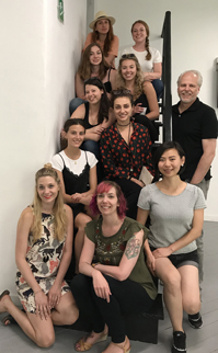
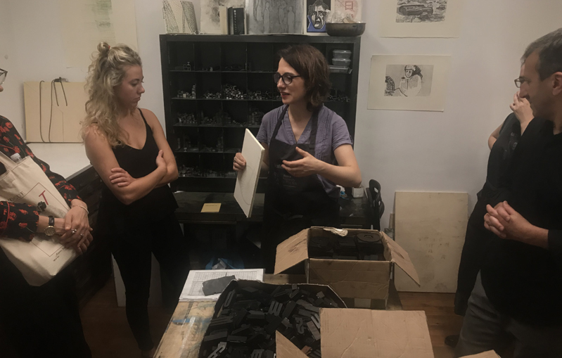
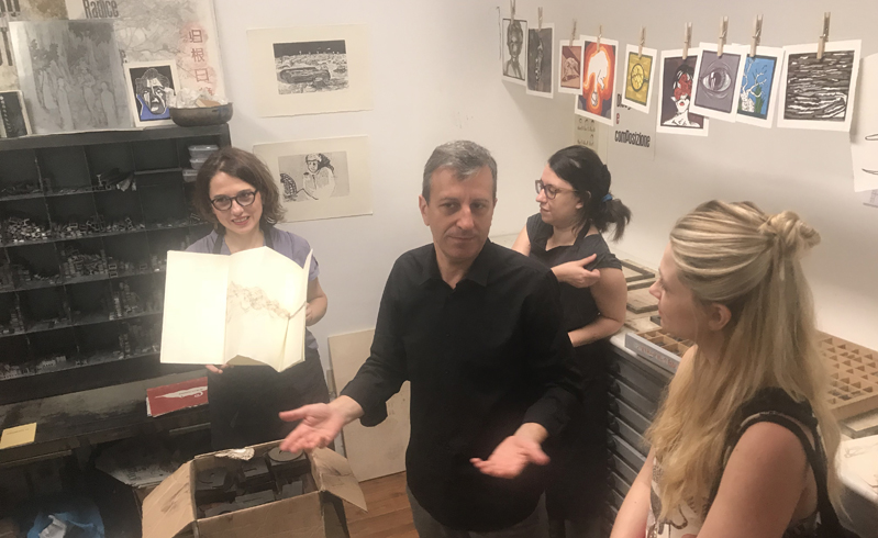
The best introduction to printmaking a student could ask for. The Letterpress Workshop at RUFA was one of the most enriching class days of the program so far. Partly, because it forced me to work outside of my comfort zone, but mainly, because the workshop was lead by the amazing professors: Maria Pina Bentivenga, Mario Rullo, Mario Fois, and two hardworking current students at RUFA.
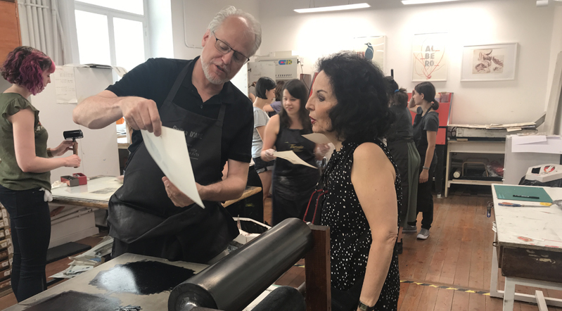
I have always been quite intimidated by printmaking. I took an Intaglio etching class in my undergrad BFA program, and felt completely overwhelmed by the process. I was envious of those that could make successful work in printmaking. Today at RUFA, our knowledge, approachable professors provided an assignment that I believe was the perfect introduction to printmaking. The workshop showed us the basics of two printmaking processes: Polyester-plate Lithography and Letterpress.
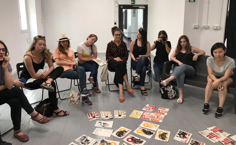
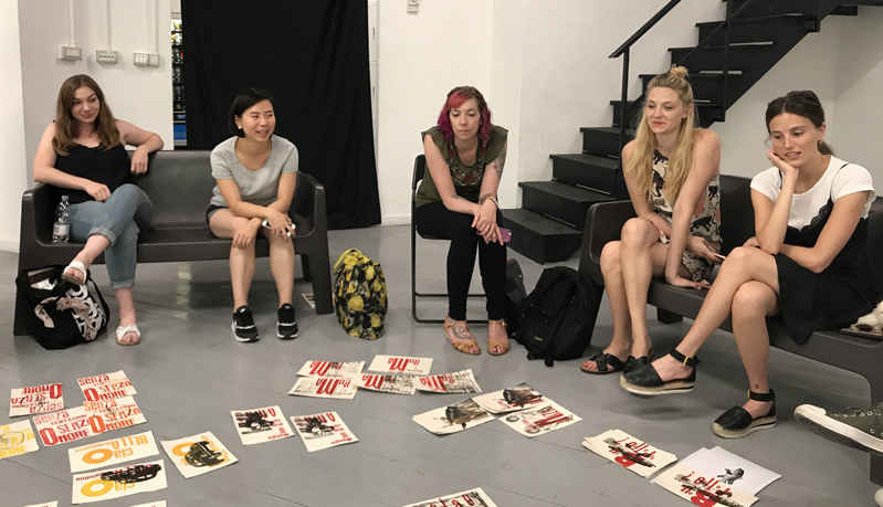
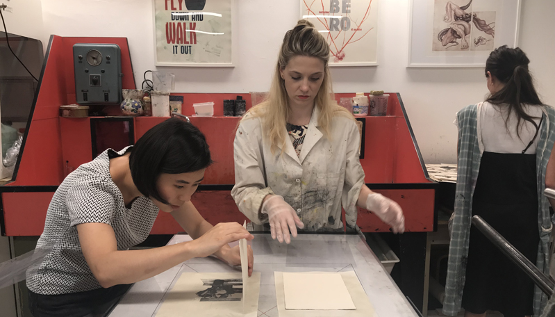
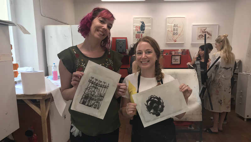
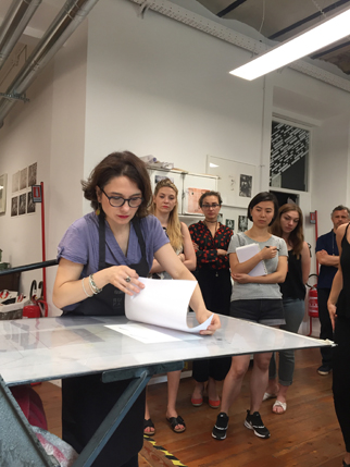
The day began at RUFA with a short presentation about the Letterpress Workshop, providing samples of past work and the parameters of the assignment. We then quickly moved into a polyester plate lithography demonstration led by Maria Pina. Each student brought a high contrast black and white photo. The choice to have the students do a one-color lithographic print, allowed us to focus on the process, without feeling overwhelmed. The simplicity of the one-color print, also allowed us to focus more on the typographic composition.
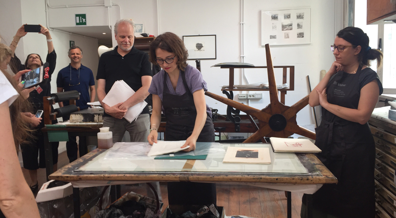
After each student created their polyester plate, we made several prints by rolling our plate and paper through the press. On my second print, I added too much ink, and my composition was almost unrecognizable. Luckily Maria Pina was always there to assist, and she showed me how to remove the ink with liquigon gomma Arabica, or acacia gum. Maria Pina always worked with a smile and made sure that each student got the attention they needed, she was a pleasure to work with.
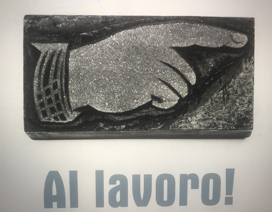
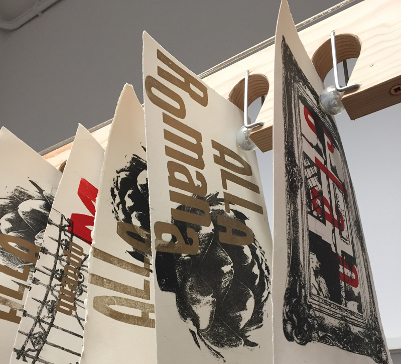
After lunch and allowing our compositions to dry, each student arranged a typographic composition in a chase. We had the following typefaces to chose from: Aurora, Forma, Razionale, and Metropolitan, and six color options. After we arranged the type, we secured the letters with spacing metal, which was more difficult than it seemed. Again, Maria Pina, was always there to help, and provided a few tricks of the trade to assist me in making my plate secure. We then rolled ink onto the letters, and ran our letterpress compositions over our lithographic compositions. Each student’s composition was very unique and it was interesting to see the difference in each student’s approach to the project.
The workshop was so fun and energetic. The simplicity of the project allowed students to be even more creative and the time-restrains allowed us not to overthink our compositions, which resulted in beautiful, energetic, and whimsical work.
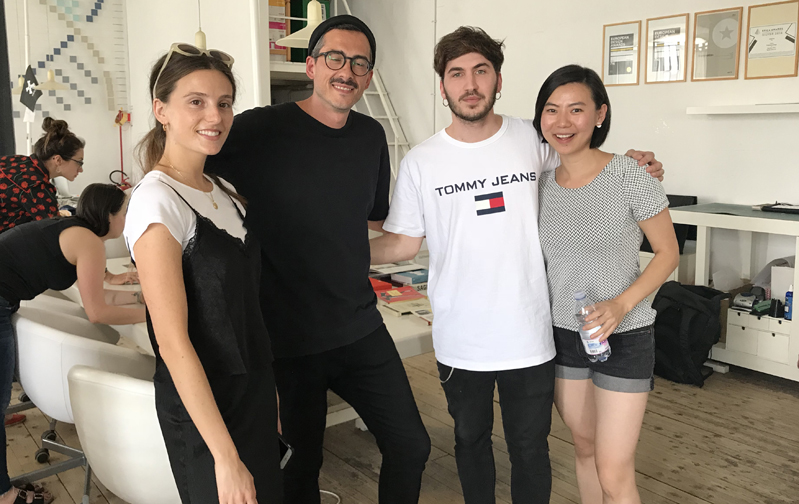
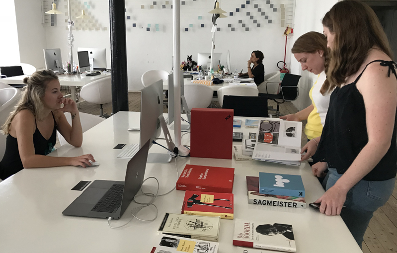
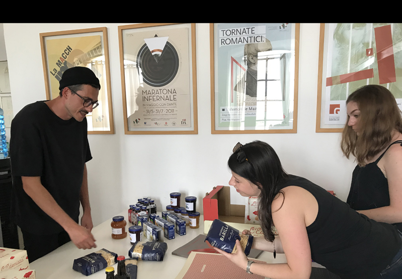
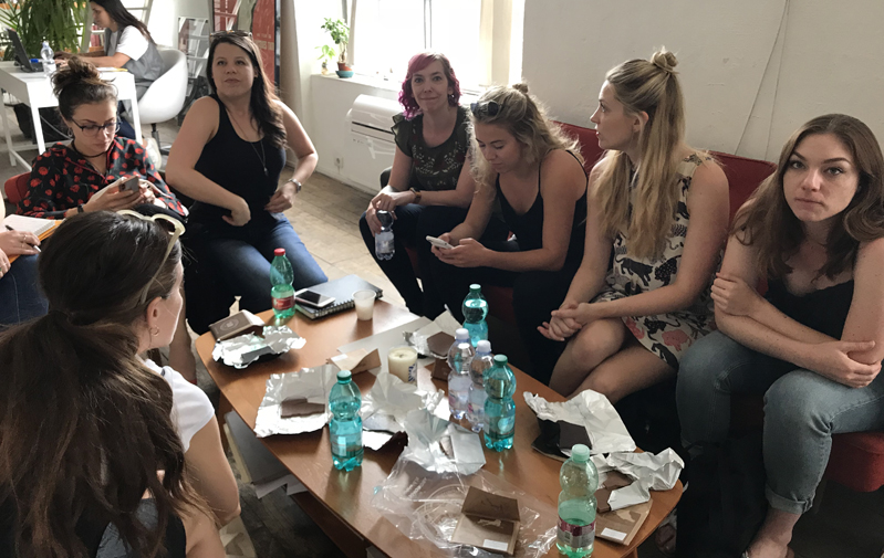
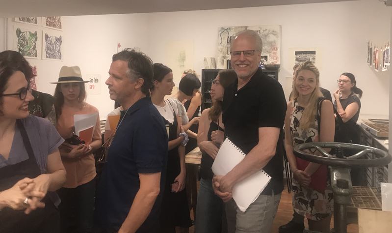
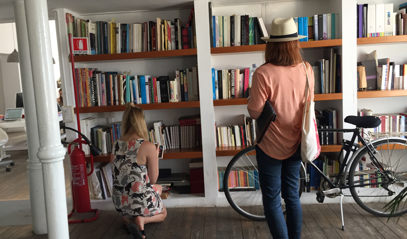
After the workshop ended at RUFA, the class walked next-door to Paola Manfroni’s studio, Marimo. The designers were so welcoming and set out a table of examples of their past work, favorite books, and samples of the most delicious chocolate, “Said”, for which they designed the logo. The designers were so hospitable, providing us with espresso, water, and letting us pick their brains about their current work. The studio was bright, colorful, chic, and filled with plants. I especially loved the avocado trees they were growing in jars on the windowsill. It was a very youthful, fun, and energetic atmosphere filled with creative minds and innovative work. Our class was very lucky to see the Marimo studio in San Lorenzo. It was a nice contrast to finish the day after working only with our hands, to then visit the modern, high-tech studio. It was nice to see that both processes are still very much alive, the old and the new.
Additional photos by Lita Talarico

