Rome Day Six: James Clough’s Classic Roman Letters
Text and Photos by Yin Duan
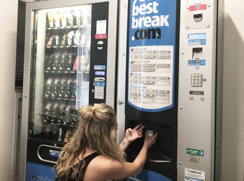
After yesterday’s project declaration session with constructive feedback from the group, everyone spent the night further defining their ideas. In the morning, we talked to each other about our evolving projects on the epic bus trip to RUFA. The campus of RUFA where James Clough’s workshop is carried out – is located in a nice suburban area (19 bus stops from our hotel with lots visual stimulations along the way). Staff at the nearby shops barely speak any English, which I find authentic and fascinating. Another fun fact about the RUFA campus is that there is a coffee vending machine that pops out the coffee and cup! We were amazed by it.
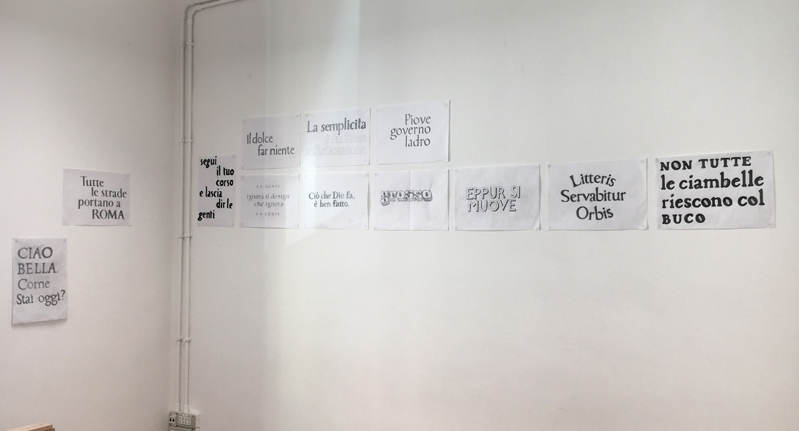
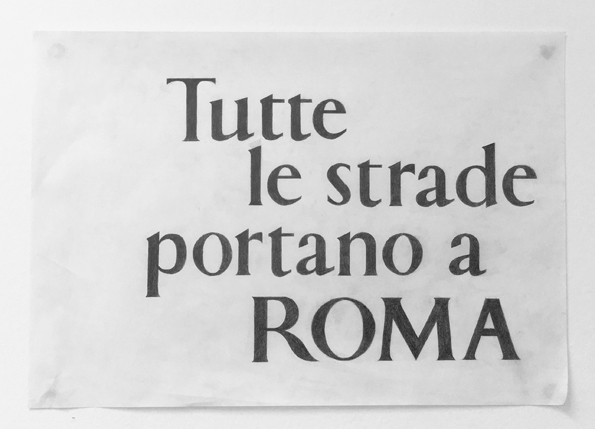
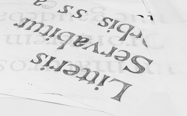
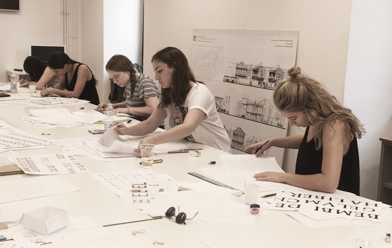
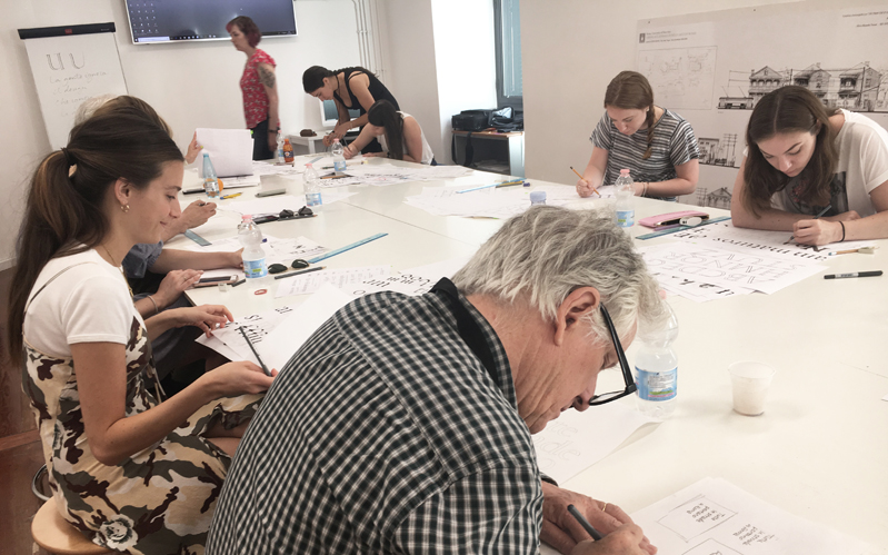
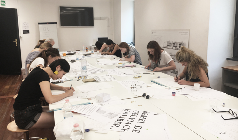
Today rolls into day two of James Clough’s workshop, we were given the brief to choose one short phrase and create our own letterforms. The letterforms need to be based on the letters enlarged from the book De Aetna by Pietro Bembo (printed by Aldo Manuzio in Venice 1495). In this way, we could learn from the classical 15th century letters. As the saying goes – learn the rules like a pro so you can break them effectively.
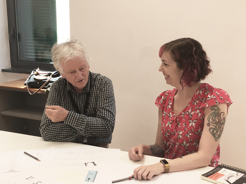
Two major take away from today’s workshop are simplicity and rhythm. James is a firm believer in ‘simpler is always the winner’ and it is the essence of letterforms. In terms of rhythm within the space, we need to look upstairs and downstairs as well as considering left and right spacing. James sat down with each of us and provide detailed constructive feedback. Taken myself as an example, I’ve simplified a few curves to straight lines of some letterforms of my chose phrase over and over again, so did I modify the composition a few times. It also means that I traced over the phrase repeatedly until satisfaction within the time frame.
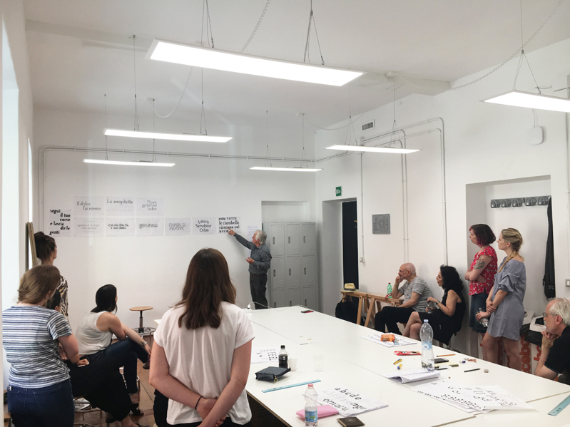
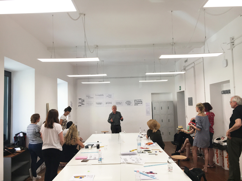
At last, we come to the critique session. James was very impressed with the ‘variety of ideas and intensity of work that we accomplished in such a short period.

