Alumni Spotlight: Laura Gunther
By Julia Marsh
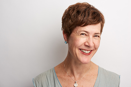
Laura Gunther leads the Experiential Graphic Design (EGD) team at ESI Design in New York City. We caught up with the Class of 2003 Alum to learn about her latest projects and inspiration in the experiential design space.
Tell us a bit about ESI Design.
Our firm is a multi-disciplinary firm, specializing in transforming spaces and creating experiences with the aim of engaging people with their environments and, more importantly, with each other in meaningful and lasting ways. We have a range of clients from corporate, to real estate, to retail, to institutional. All of us at ESI collaborate in teams of designers from different disciplines bringing our own expertise to the table. My specialty is using a space as a canvas to visually establish a brand, document and map spaces, and interpret content.
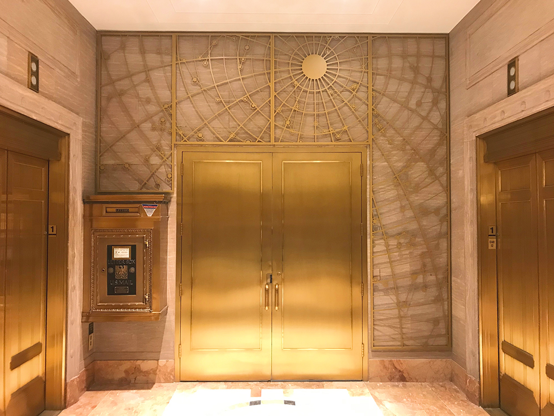
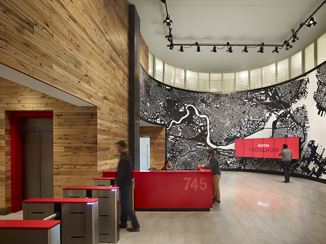
From a branding perspective, this involves establishing a palette of colors and materials and building a visual vocabulary of typefaces and forms to fit the varied needs of spaces. Then I work with other designers to make sure those elements are integrated into the furniture, the building, the media, and marketing materials so that we have a unified final product. This type of work allows me to experiment in a traditional way with letterforms, color, and composition. However, unlike print design, it also includes testing new materials and considering how they will be seen from different vantage points.
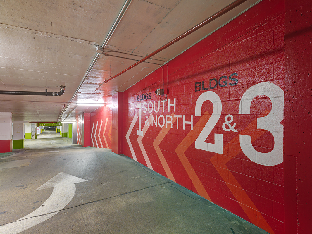
From a signage and wayfinding viewpoint, I document and map out spaces. Then I consider how visitors will behave within those environments as well as how they will move through them. I create a range of graphics including large-scale wall murals, building identifications, signage systems, and wayfinding nuggets to assist in their movement. I love maps and I love puzzles. This type of work speaks to both of those passions.
The third aspect of EGD design at ESI is interpreting content visually. I enjoy this type of work for two reasons: 1.) I get to be a student again and learn about a subject in depth, exploring a whole new world of stories and images and 2.) Every project is completely different. While the bulk of this work is for our institutional clients, like the Motown Museum or Edward M. Kennedy Institute for the Senate, we also try to bring this level of interest to our corporate clients; informing visitors about critical local history or scientific aspirations related directly to the space.
What are some of your recent, favorite, most challenging, or most interesting projects?
My favorite current project is the Statue of Liberty Museum. It’s an honor to be involved in such an iconic, historic project. In addition to learning so much about the statue herself, it’s been an amazing experience collaborating with so many different partners and stakeholders. At times, working together with a myriad of people has been the greatest challenge as well, but we know that it’s the collective effort that will make for an incredible museum.
I was given the daunting task of designing a logo for the museum. How do you symbolize an international symbol, which is already used to represent every possible business under the sun (car dealerships, insurance companies, sodas, funeral homes, etc.)? How do you embrace history while looking forward? How do you please all of the entities involved? In the end, a blend of Ronaldson (an historic typeface) and Museo (a contemporary one) were paired together with a representation of the torch in three logo formats (stacked, horizontal, and torch-centric). Like many logos, the use of the torch and an historic typeface seems like a very obvious solution, but it was a challenge getting there. Once the logo was established, I worked together with one of our senior media designers to develop a palette and family of typefaces for the museum, with so much content and so many forms of communication a large visual vocabulary was essential.
Collaboration is key to our work at ESI. When the project began, we were fortunate to have a Ph.D. in American History on staff as the lead content developer, who collaborated with a board of history professors and the museum to develop the “big ideas.” Then working together with her and a senior physical designer, I mapped out how the story would be told in the physical space of this brand new museum. Once the approach was established, breaking down information into hierarchical levels and layers and the actual design of the interpretive signage began. This step entails thinking about engaging different types of visitors – people who pass through quickly, taking in mostly bold visuals and broad themes and then those who study every detail like an encyclopedia. It also means establishing a system of visual chapters and subchapters, giving visitors an overview of the main ideas and visual clues to where they can dive deeper.
Currently, we are in the production phase of this project. This requires shop reviews at the fabricator’s, scrutinizing shop drawings, navigating image acquisition, art directing other graphic designers, collaborating with all partners and tweaking designs, approving samples, and, of course, keeping the client informed and content. Best of all it includes on-site visits, where it’s exciting to see it all finally coming together piece by piece.
We love learning what inspires our students and alums. For Laura, inspiration often comes from the people around her.
How do you stay inspired?
With a full-time job and two young children, I need to make a conscious effort to get out and see formal exhibits in museums. Fortunately, I live in NYC and am surrounded by loads of visual stimulus on a daily basis. It’s part of the reason why I love going for walks and bike rides. There’s just so much to see.
I also am inspired greatly by my coworkers who are a diverse body of designers with many talents of their own. We have regular sharing sessions at ESI where people present their passions and outside projects to others. These are generally very light-hearted in nature, but a serious level of inspiration is to be gained at every presentation.
Lastly, doing visual research for my projects and being involved with the SEGD (Society of Experiential Graphic Designers), I discover other designers in my field doing wonderful work in my field.
Which designers do you admire most nowadays?
As an EGD designer, I find the work of Andreas Uebele (Büro Uebele in Germany) to be very inspiring. He’s taken ho-hum wayfinding and signage systems to a level of art. His firm’s use of type is bold and unexpected. The way they reconsider spaces is highly sophisticated. And best of all, I love that there’s an element of playful invention in everything they do.
In pursuit of using basic materials and minimal technology to achieve astonishing results, I was intrigued recently by an installation in California by Refik Anadol called Cirrostratus. It’s very simple construction – made of narrow, colored glass panels hung perpendicular to an exterior wall of a concrete parking garage. The effect from a distance is a 2-dimensional geometric pattern of color and movement caused by the sun and clouds moving across the sky. It’s only at an oblique angle when you see the blades attached to the building that you understand how the magic is achieved.
Finally, we hoped to learn what insight Laura could offer now that he’s spent some time outside of the program. For future students, this perspective can be invaluable.
What advice would you give incoming students?
The world is your oyster! Take this time to really explore ideas. There are no wrong answers. The MFA Design program is very much grounded in the real world of design, but at the same time, it’s a very safe place to experiment, to figure out what you really love. What you do here, will lay the groundwork for what you do later. Make it count.
Also, your fellow students are an amazing resource. I learned so much from the students in my year. We all were answering the same design questions, but we all did it completely differently. The variety of approaches and solutions was fascinating and eye-opening to me. It taught me to be more mentally flexible and let loose a bit.
What is your favorite part of the MFA Design program?
The opportunity to connect and learn directly from world-famous designers. The insight and encouragement they provided was life-changing.
Did our program’s multidisciplinary approach help you?
It’s shown that graphic design is multifaceted and that we are capable of much more than we initially think. By doing something a bit out of your comfort range, you discover new interests and talents. Rooted in the “Designer as Author” concept, it empowers you to realize a wider range of your abilities and use them. It also gives you appreciation for the work other designers do. This has been key in my career as an EGD designer where I depend on others to develop holistic designs and then to get them produced.
What impact has SVA MFA Design had on your career?
Through SVA MFA Design, I discovered my dream job. I was a graphic designer before starting the program, but I was uninspired and pigeon-holed into a niche I didn’t want to be in. During a studio visit in the second semester of my first year, I met my future boss and ascertained that I wanted to work for him some day. I then forged a thesis path to make sure I would move in the ESI direction.
If you could choose a thesis topic today, what would you pick?
That’s the toughest question of all – saving the best for last, I see.
I recently went to the Color Factory experience downtown and found it utterly underwhelming. The brand was strong, but the experience was half-baked. There were so many hopeful beginnings and then drop-offs with no segues to the next activity. I left the experience thinking it was sort of fun, but there was no real point to it. It was just a pop-up selfie environment. Maybe I could work on something similar, but make it more rewarding? It could be an exploration of a rich topic like color or maybe a sort of playful wayfinding experience – using humor and visual bread crumbs to guide someone to a meaningful payoff at the end. Maybe it’d involve different senses? Maybe it’d be a “Choose Your Own Adventure” sort of experience? The clincher will be figuring out how to make it marketable.
To learn more about Laura’s work, we encourage you to explore the ESI Design website.


