Alumni Spotlight: Najeebah Al-Ghadban
Najeebah Al-Ghadban MFAD
What it’s like to work at The New York Times?
I’m currently a full-time designer at the New York Times Magazine Labs. It’s a part of the NYT Magazine that’s responsible for the monthly special newsprint sections including the Kids section. It’s spearheaded by Editorial Director, Caitlin Roper, and Art Director, Deb Bishop. We’re a relatively small art team (Deb, me, and our freelance designer and fellow alum Leticia Sarmento) that gets to work on packaging different content—including a yearly puzzles section, fiction section, a summer guide, or a section on genetic testing, all in addition to the monthly kids special.
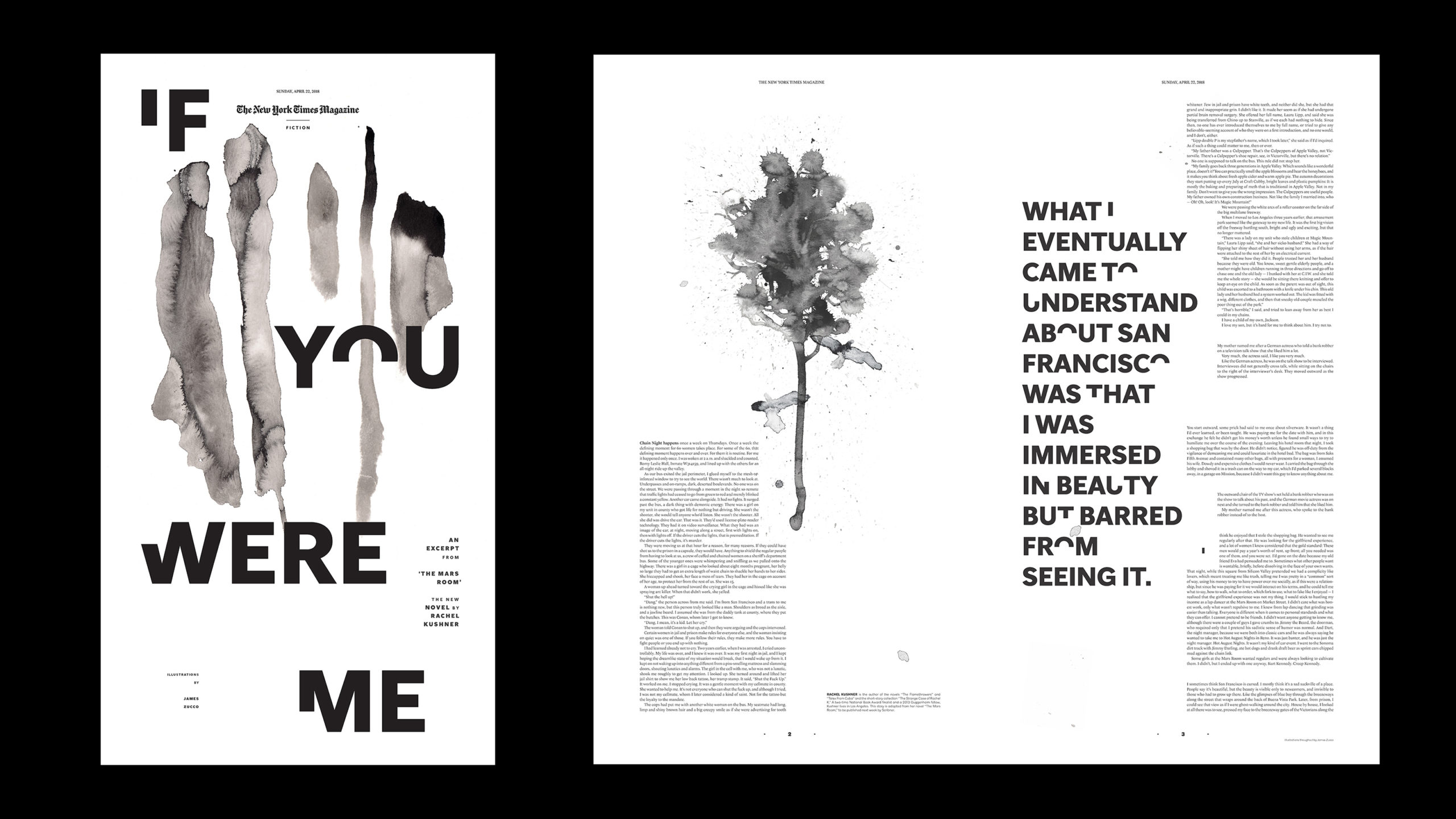
I’ve been here about a year and half. One of the sections I enjoyed working on the most was the special fiction excerpt from Rachel Kushner’s The Mars Room featuring art by James Zucco. For this section, our editor selects an excerpt from a book she’d like to feature and I got to work closely under Deb’s direction to commission art, and propose design-layouts to create a more unique reading experience. As we’re on newsprint, we like to take advantage of the scale it affords. But also, look for meaningful ways to break tradition when possible and create something that’s a keepsake. Maybe something you want to hang.
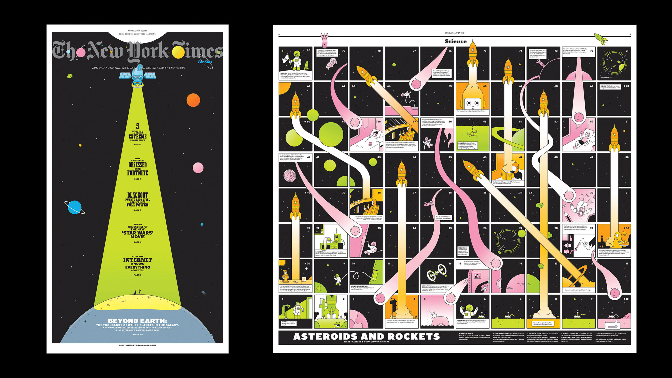
The Kids section, on the other hand, is more formatted, and is an opportunity to collaborate and discover great illustrators and artists. These sections have a lot more content for us to work with, and a lot more variety. We look towards finding ways to incorporate interactivity since we have these huge center spreads that act as our main feature. One of my personal favorites is a game we created last year, with illustrator, Giacomo Gambineri, that’s an astronomical take on Snakes and Ladders.
We’ve also started to break out into more special Kids issues that are tightly themed: we just finished the Comics issue, and earlier this year, the Humor issue. With these we get to break the design format a little more which is always fun for us!
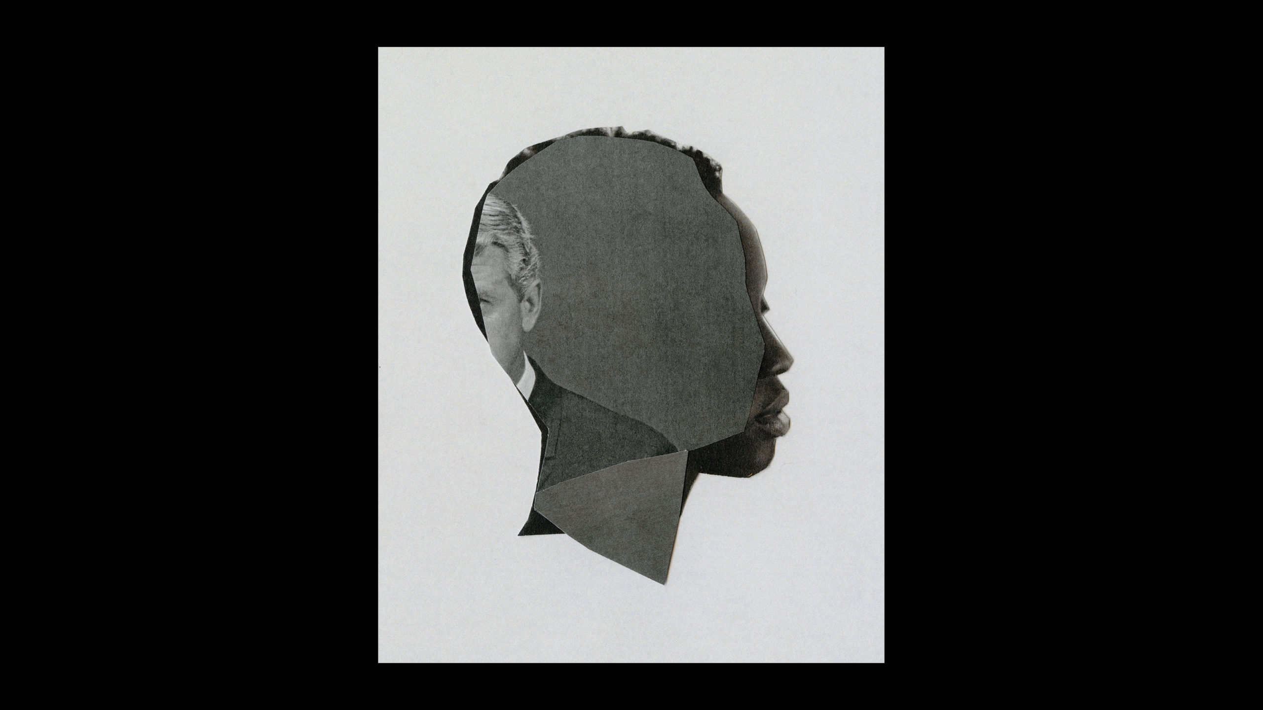
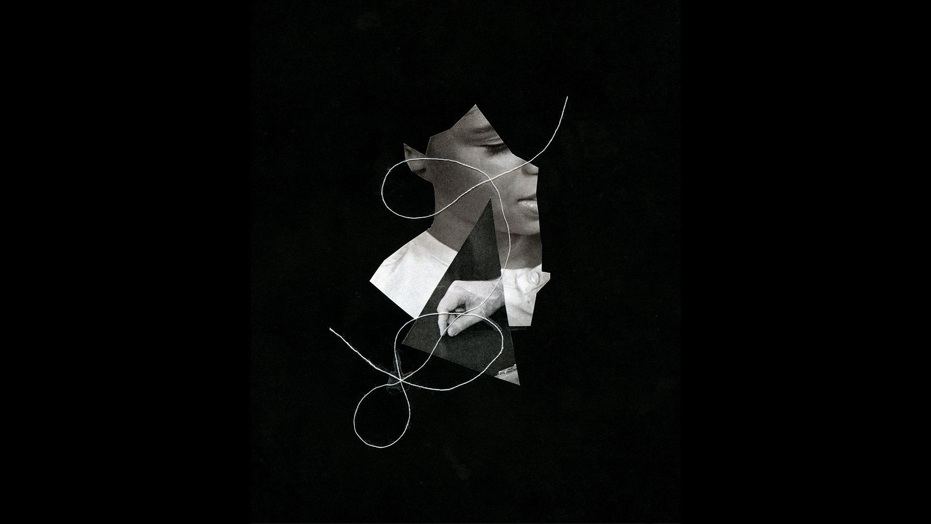
On my night shift, I continue to operate, mostly as a freelance collage-illustrator but sometimes designer. I’ve gotten to create illustrations for a lot of great publications including most recently the New York Times Magazine for a beautiful Claudia Rankine piece on White Male Privilege. I’ve also worked with the NYT Book Review, Buzzfeed, The Baffler, and Anxy Magazine. Collage-Illustration exercises a whole other side of my skill set. Working with both array (design) and disarray (collage) keeps me in balance. It’s also a great honor and privilege to be able to do both professionally.
What are some of your recent, favorite, most challenging, or most interesting projects?
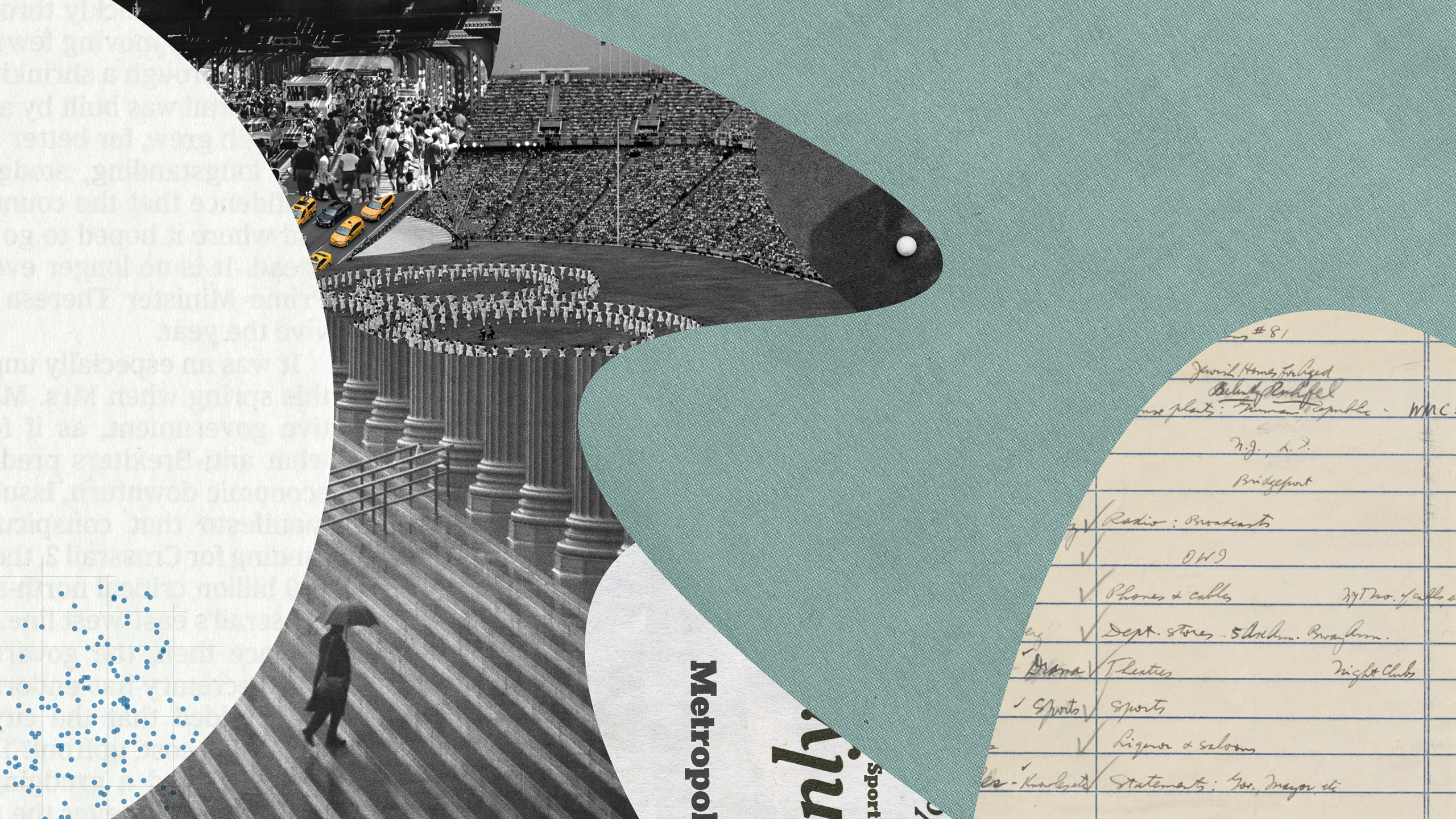
One of the most challenging projects I’ve had to work on is a commission by the New York Times Branding department for 9 murals. When I first started making collages, a lot of which I explored during my time in my MFA Design, I worked at an incredibly smaller scale (less than 5 inches). This project was a proposal to create 9 distinct large-scale murals for 9 floors of the prestigious New York Times Building. I immediately said yes. My art directors specified a theme from the paper for each floor—for
Unlike editorial illustrations that are on a short deadline, or artwork that I create solely for my own exploration, these murals were going to exist in a public space and served a different kind of client than I was used to. Essentially these played a larger ‘branding’ role as opposed to the usual editorializing of a story, or an emotion. Each piece of art had to feel representational of a brand that is so rich with history and should be able to communicate it all including its present and its future. I had gotten the commission a month into my new job, and for someone just walking in, it felt quite overwhelming. It was difficult to imagine being able to fulfill such an enormous prompt. The pressure was enormous. And yet somehow we managed! We were able to pull in an incredible production magician and artist, Doug Padgett, who helped make sure these pieces looked just as great on the wall as they did on screen. One of the images I’ve included is the mural for the Metro and Sports floor. It’s one of my personal favorites from the collection. Seeing them on each floor now is very surreal.
Which designers do you admire most nowadays?
There a lot of influential designers who I’ve been able to learn from, and a lot whose work I’ve watched and admired. But personally, the one body of work I keep coming back to is not a designer’s, but an artist’s: Jenny Holzer. The particular work: her Inflammatory Essays.
What do you do to maintain your personal creativity?
My source of inspiration tends to be outside of the design realm. Movement inspires me—whether it’s a trip, music, seeing a dance or a film. Context of people and objects inspires me. Mostly understanding human psychology inspires me. Both design and illustration are forms of communication, and while I do love to get lost in stacks of eye candy, I like to explore ‘how’ to make something communicate. The best way for me to learn that is to consume a lot of art and writing. Especially writing. Sometimes it’s in the history of symbols and ironically, I learn this best when written as abstract words. On the other extreme, I also find it imperative that I make room to not know, to be playful, get out of my head, do nothing, just feel. Maybe that falls under movement too.
What current trends are exciting to you?
I don’t really pay attention to the trends. Some things that are trendy start off that way for a reason, but also I was taught in my schooling that nothing is original. So a trend, a copy of a trend, it’s a wheel to me. You can get on it, you can get off it, or you can find different ways to build it. Some days the wheel will roll, others it won’t. When it breaks, you fix it. You keep moving..
Where can we see your work?
Look out for the Kids section on the last Sunday of each month. If you want to keep up to date with other special sections or my illustration, I tend to post my recent work on my Instagram.
Do you have any advice for incoming students?
My advice for incoming students is to commit to what you love. To this day, my thesis, Four Fold (digital artist books), is still an interest of mine that I’d love to push but I continue to explore in my professional life, where possible.
First year: design bootcamp is where all the magic happens. Pay attention to what you keep being drawn to create. The patterns define your thesis. Looking back now, I realized a lot of the work I explored in each of my classes tied down to the same thing—creating a visual and typographic, one could also say editorial, narrative, which is what I continue to do now.)
What impact has SVA MFA Design had on your career?
The connections I made between teachers and students played a huge role in my career. My teachers helped me get to where I
How has the program’s multidisciplinary approach helped you?
Having come from a traditional print world, I found that all the skills we learned about UX and UI transformative. The landscape has been shifting for a while. Working for an exclusively print-section of a big newspaper as it evolves its digital side simultaneously is a very unique and exciting vantage point. You see the importance of understanding how these fields intersect and also how to communicate between them be it in terms of business, in terms of content, and also design and interactivity to make them distinct.
If you could choose a thesis topic today, what would you pick?
Today, next month, ten years from now, I would choose the exact same one.

