Roma Day 1: Typology
By Shana Hale
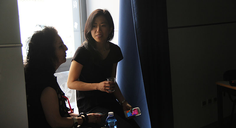
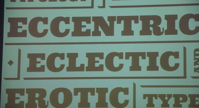
Today at La Sapienza, Università di Roma, we listened to our first lecture by Steve Heller. He discussed the basis of “Typology” and how type can be eccentric, eclectic and erotic. Beyond its readability and functionality, type has expression. Type is the “lingua Franca,” the common language for all designers.
From the mid-late 19th century through the early 20th century, we learned about how type got its start in commerce and advertising—before images and other types of graphics became popular, type was used to grab a consumer’s eye.
The ‘erotic’ aspect of type stems from the ‘kiss’ of the metal type touching the paper, the ‘hickey’ or dot left on the paper. One can feel the caress or stubble of some typefaces.
Various methods of producing type, from rubber stamps, wood, stencils and metal were used as well as methods of showcasing type, such as Trompe-l’œil (shaded) type that projects the message effectively with dimensionality.
One of the more interesting findings was of the typography parlant, which speaks to what the type is (i.e. ribbon, speed, etc.)
Art deco was a reaction to the previous art nouveau, which showcased type that was less ornamental and frilly. Next came the dada typeform which was against art traditions. Modernists focused on lettering and were anti-calligraphy which was considered bourgeois.
The lecture discussed corporate identity, especially the IBM branding made famous by Paul Rand. We also delved in the punk movement which used ransom letters in its type.
Among a few of the videos shown, we were able to view Tibor Calman’s “Talking Heads” music video which used moving type and word puns throughout the video. All in all, we really learned a lot about the history of type through the present. Looking forward to tomorrow’s walking tour with Louse Fili!


