Alumni Spotlight: Jong Woo Si
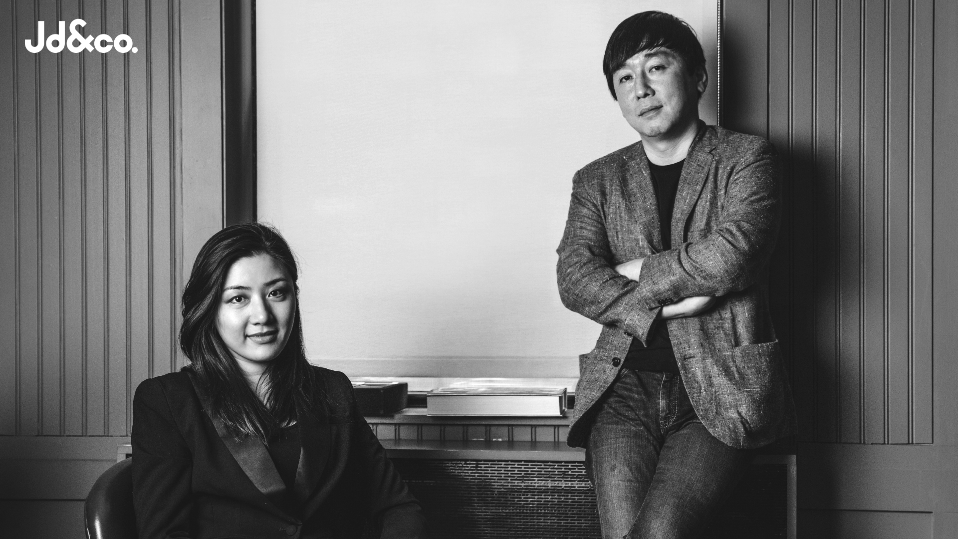
When we heard Jong Woo Si MFAD’06 had started a new design firm, Jd&co. Design, we thought it would be a great time to catch up with him. What are you doing professionally, Jong? What have you done in the past and how did you start your studio?
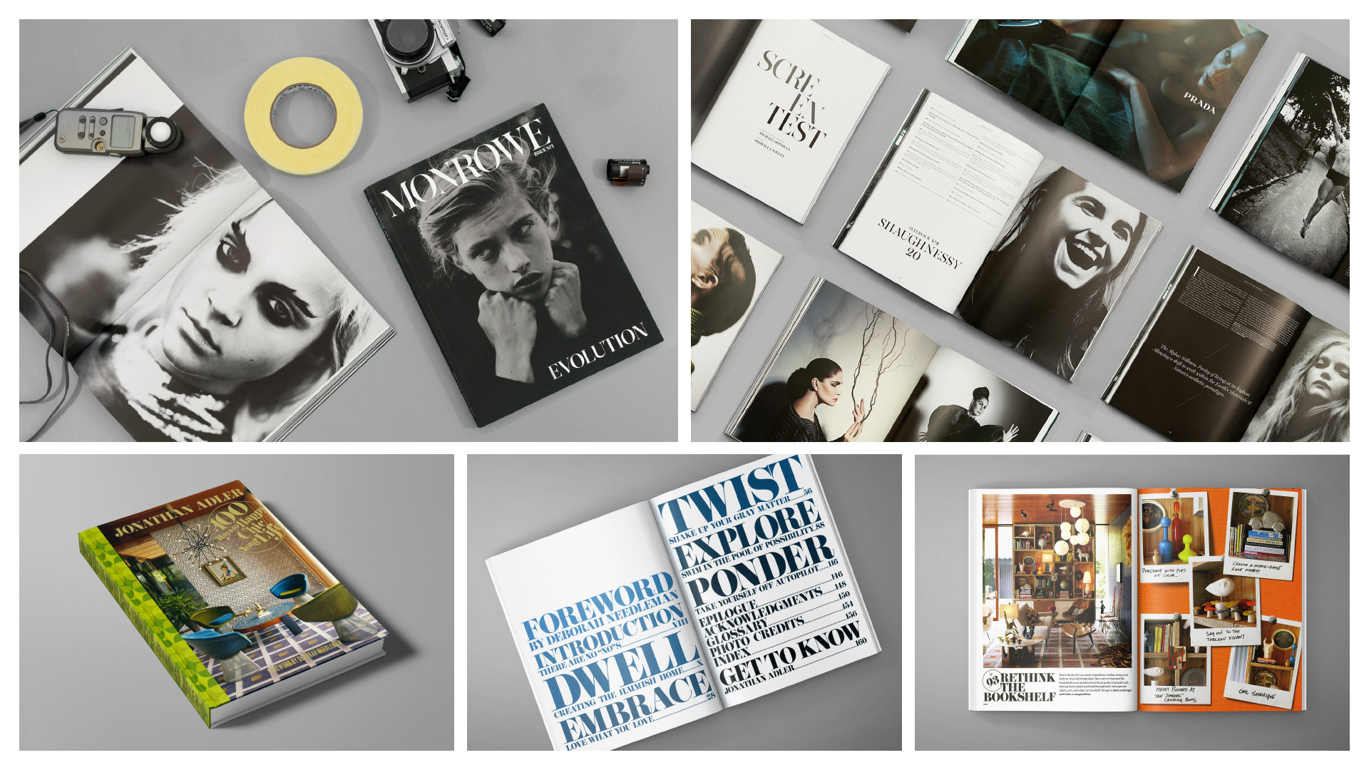
I’ve been privileged to have worked at some great agencies and companies across the years where I’ve honed my skills and expanded my experiences. I’ve worked at AR NEW YORK, Siegel+Gale, GB65, Me&Friends and Ralph Lauren. A highlight while at AR New York was the opportunity, I was given to design the St. Regis Hotel and Residences logo and branding system.
Like most, I’ve also been a freelance designer, working at Sagmeister Inc. and Wolff Olins. With Stefan Sagmeister, I designed the Aishti logo for the Lebanese luxury department store. While at Siegel + Gale, I designed the Xfinity logo (high-speed cable and internet service) for Comcast, the Neustar logo, and Turnaround logo. I was a part of the team that worked on the Microsoft new branding system, USA Today refreshed branding system, Pfizer’s new logo and the Ronald Reagan Library logo.
After my time at Ralph Lauren, I met my soul partner Da Kyung Lee who was an art director at Chipotle. Her design style is very organic and hand-drawn, while mine is more organized and mathematical. We thought that by combining our styles, we’d make something unique and hybrid. That is the idea that grew into Jd&co. Design.
Tell us some of your recent, favorite, most challenging, or most interesting projects?
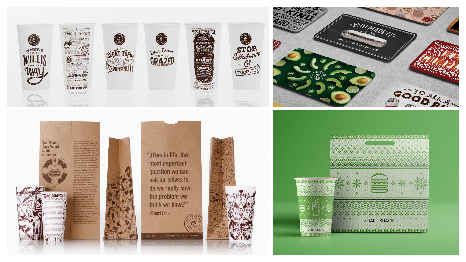
We’ve had a great relationship with Chipotle for that past 5 years. Jd&co. Design works in collaboration with the in-house team to design menus, packaging, promotional materials, and event collateral. HelloFresh is new client within the past year and with whom we focus on providing brand production services, specifically paid social assets. As the company grows at breakneck speeds, the in-house team is constantly evolving their systems and has a great line of communication which we so appreciate.
For Shake Shack, we’ve had the privilege to design the 2018 and 2019 Holiday Packaging system. Because Shake Shack is a global franchise, we were restricted from using any imagery that denoted a specific religion or faith – no six-point stars, no Christmas trees – but those limitations stimulated our creativity. Fortunately, the client liked our output and the first campaign was very successful.
Which designers do you admire most nowadays?
I like Anagrama, which is a boutique design agency in Mexico. They always try to combine a Modernism style with Postmodernism style. They have strong knowledge about the fundamental rules of design – a strong grid system and use of typography – but they know how to break the rules of design and play with unexpected design touches. It always gives me pleasing surprise.
What keeps you inspired, Jong?
Research. I have spent 40% of my hours on researching other design agencies worldwide. They give me insights on how to see the world differently. Also, I read a lot of liberal arts books because they give me knowledge about humanity and our patterns of behavior.
Any design trends you love? Which ones make you cringe?
I watch market trends but really don’t take them too much to heart. All clients are unique and have different needs. I try to visualize the needs of each client using a variety of techniques. I like and admire the true classics from the old masters, and I am very interested in modernizing their masterpieces. I call it “NEWTRO (NEW-RETRO)”.
You can see our team’s creative work on the Jd&co. Design website – www.jdnco.com. And we also like sharing our extensive portfolio here – http://bit.ly/JdncoPortfolio
What advice would you give incoming students?
Do what you want. Don’t hesitate. This is the only time that you can explore many different design skills and style. When you have a job or work at a design agency, you’ll need to compromise/curb some of that creativity for what the client’s goals are, so have fun now, when you can!
Tells us about your favorite part of the MFA Design program?
Great teachers. It was my honor to have classes with some of the world’s most creative designers/ faculty members like Stefan Sagmeister, Gail Anderson, and Steven Heller. They showed me the expanses of visual communication.
What impact has SVA MFA Design had on your career?
Most teachers in the program are practitioners and have their own studio. They know what the trends are in the business world and what is actually going on outside the classroom walls. They are the bridge between school and actual design field outside. They prepare us to be ready to work immediately. When I left SVA, I felt that I was fully prepared to work in the real world. That confidence is my one of the biggest assets when I pursue my work.
How has the program’s multidisciplinary approach helped you?
After the first year, I realized how narrow my point of view of understanding everything around me was. The program helped me to develop how to think broadly and accept things without prejudice. I left being able to approach design projects with many different viewpoints.
If you could choose a thesis topic today, what would you pick?
I feel that I deeply fall into the bog which is “commercial and practical design”. If I were to go back into the program, I would want to study the history of typography one more time and design my own experimental typeface!

