Alumni Spotlight: Tim Cohan
Ron Callahan
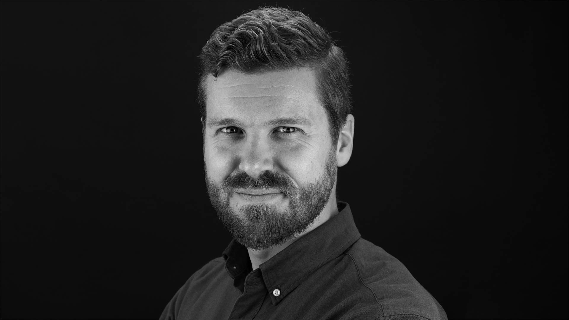
Tim Cohan MFAD ’14 is an Associate Partner at Pentagram Design’s New York Office. Tim tells about some exciting projects he’s been working on and reflects on being a student at SVA MFA Design.
Tell us what you did for Warner Bros.
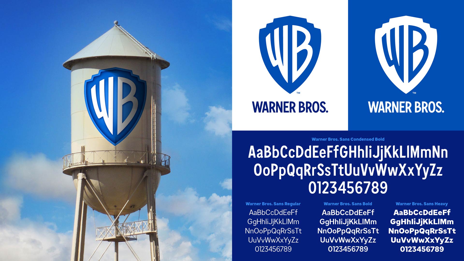
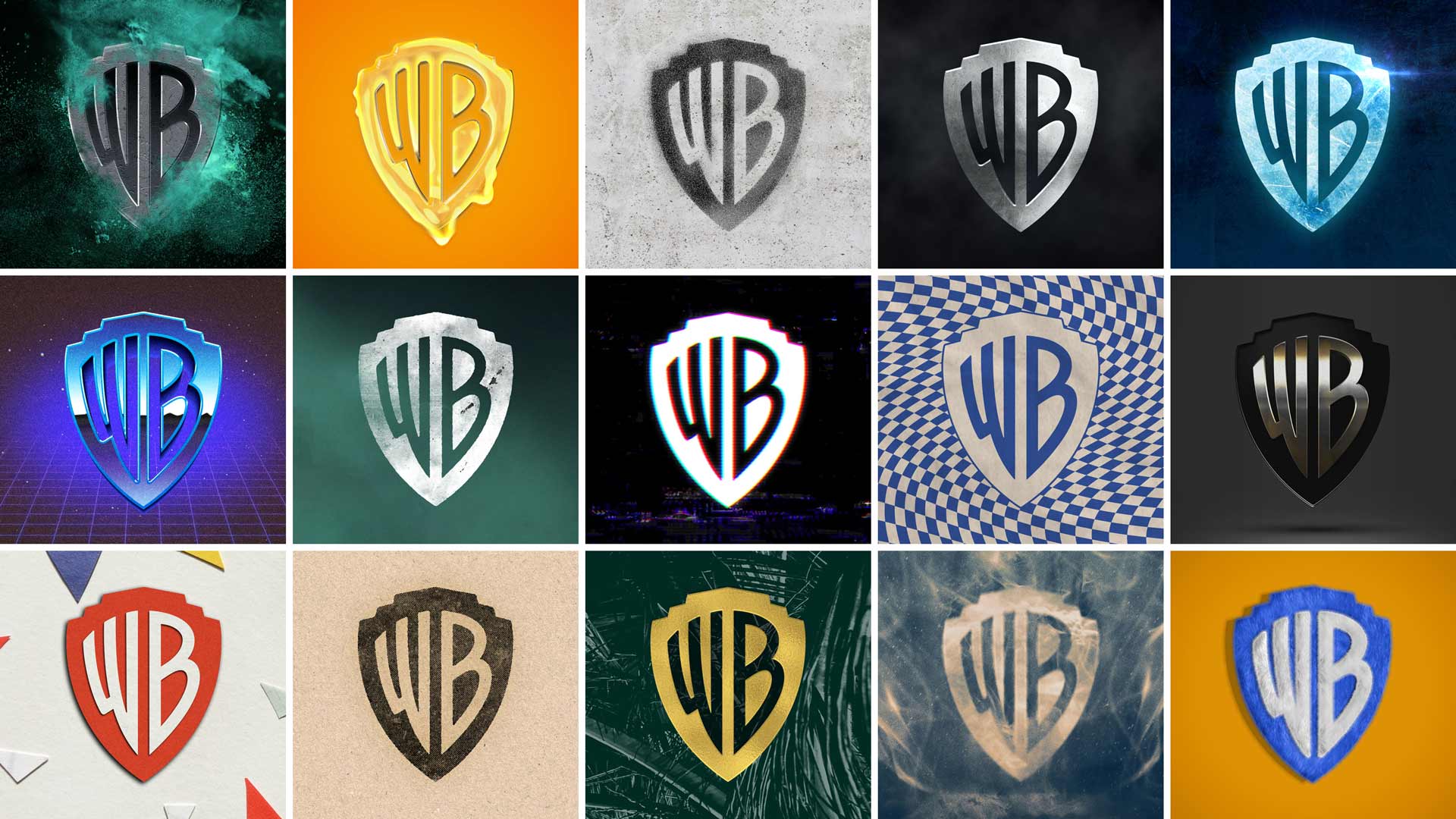
We have had a few exciting launches over the past year. The most recent is the brand strategy and visual identity for Warner Bros., which was unveiled in November. The new logo embodies almost 100 years of brand equity, and its simple form makes it easy to use in any application. We created a comprehensive brand guidelines manual and collaborated with Jeremy Mickel to create a custom typeface in four weights. It is expected to appear in theaters in early 2020.
What else have you been working on?
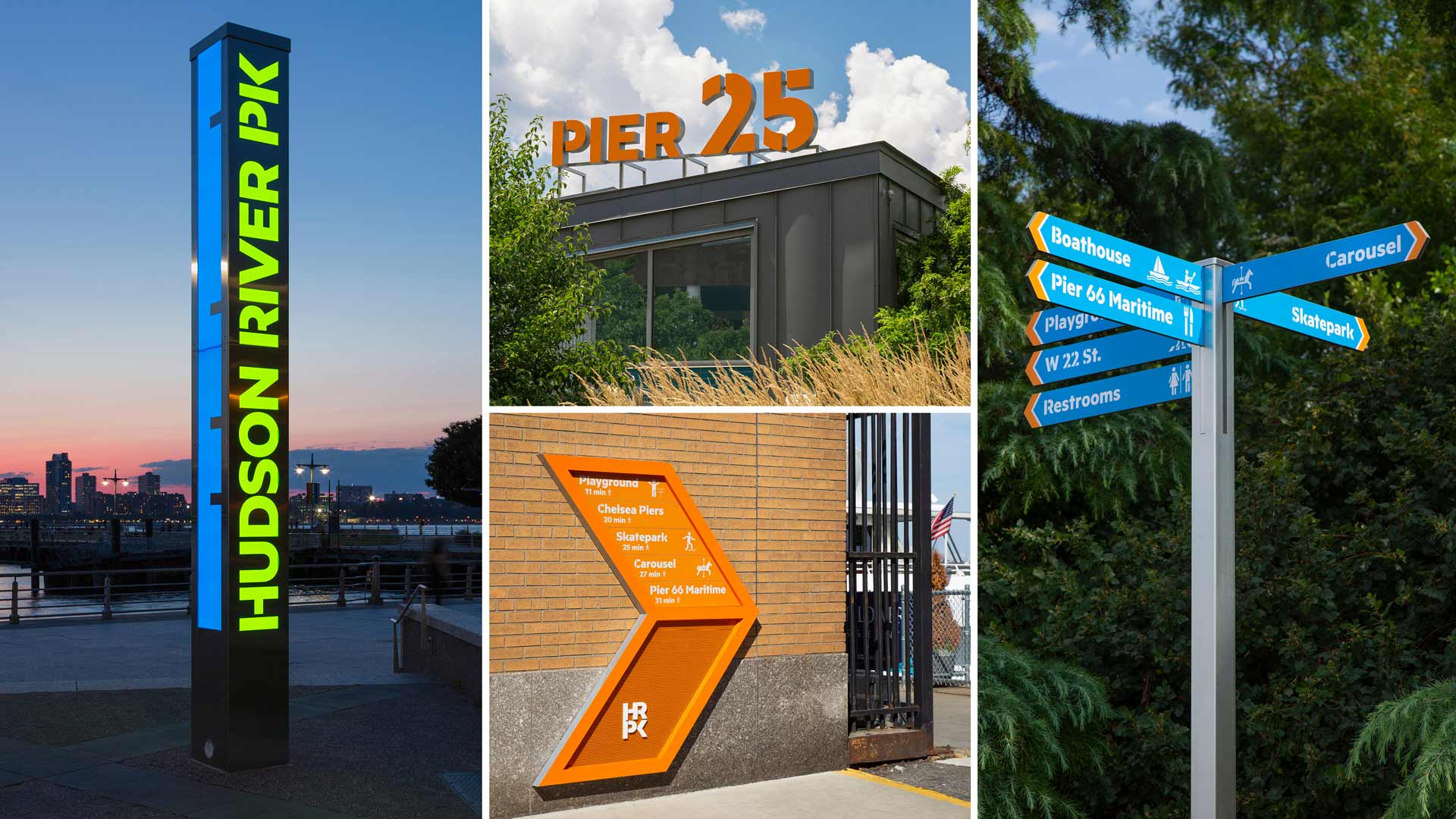
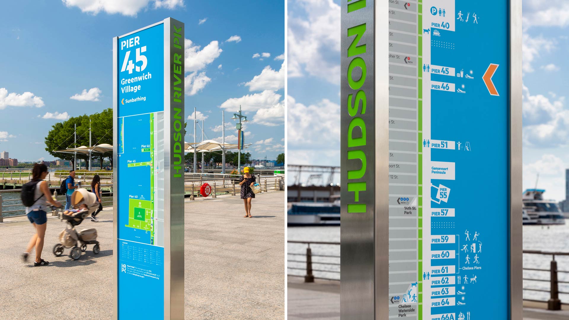
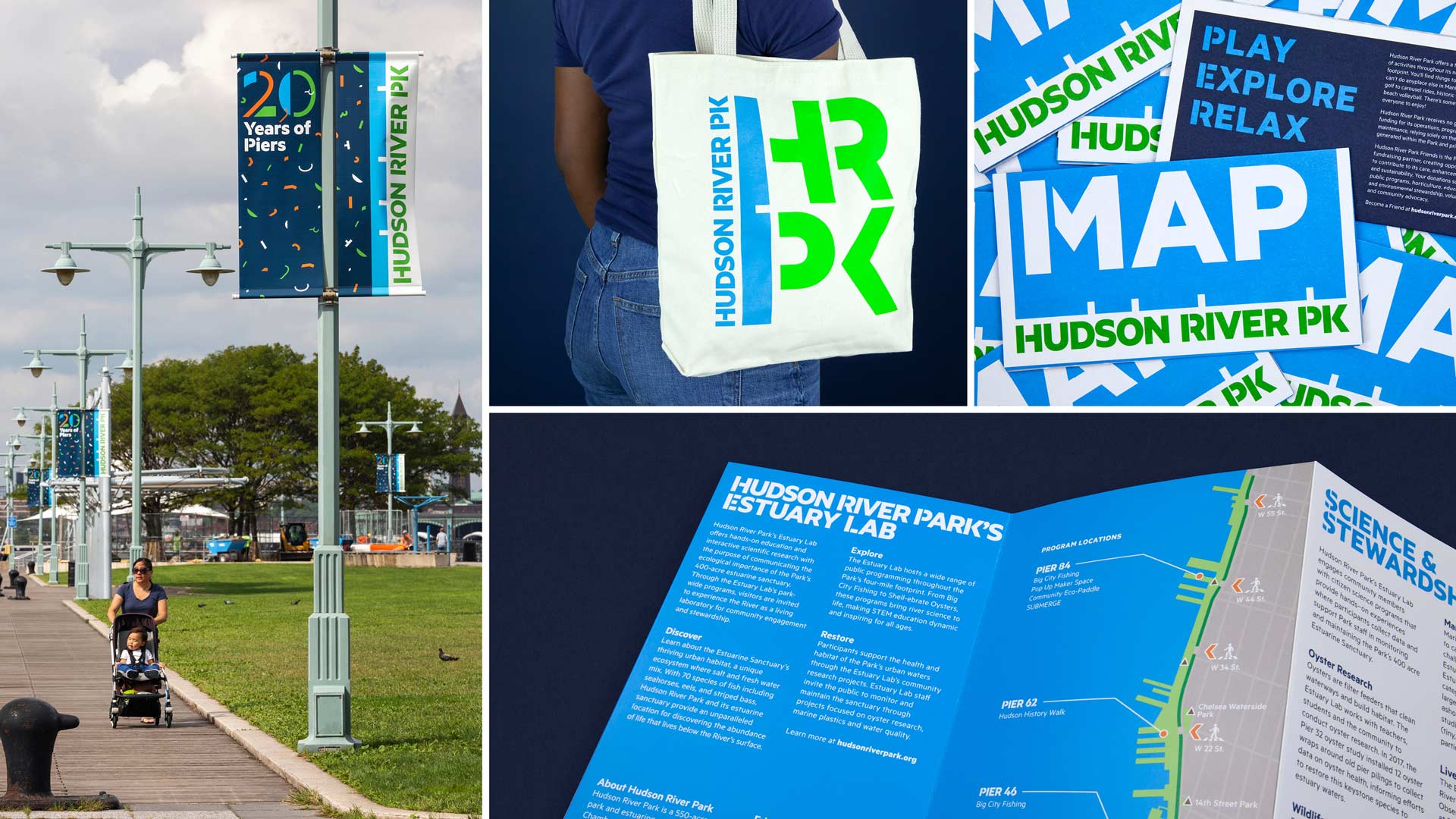
Another project that is proudly out in the world now is the Hudson River Park brand and signage system. It is the park’s first permanent signage program comprising over 400 signs across four miles of the Manhattan riverfront. We also created marketing materials, the park map, and a system of banners based on HRPK’s custom symbol library. This was my first project with Pentagram and happily I’m still working with the HRPK team on various extensions of the brand and signage programs.
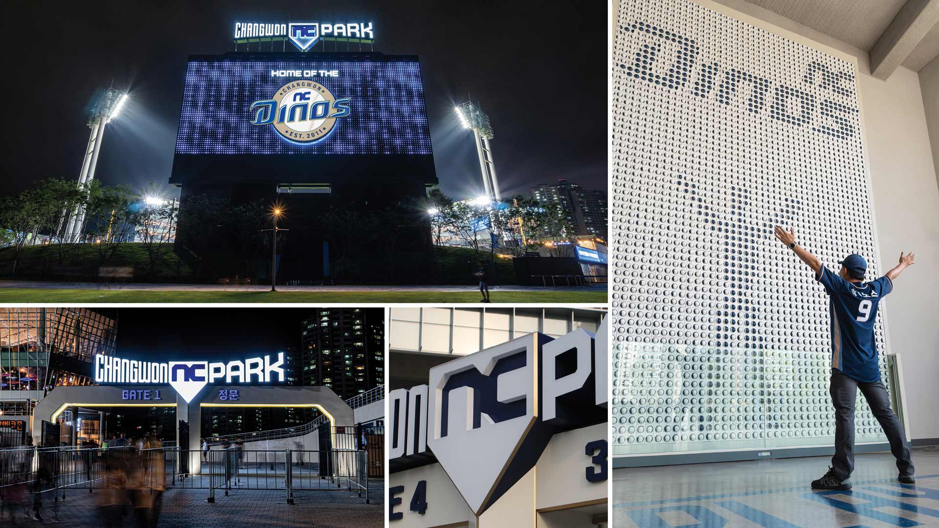
Lastly is an international project for a completely different type of park. Working with the Korean company NC we designed the identity and the feature signs for Changwon NC Park: the new home of the Korean baseball team the NC Dinos. Unveiled to fans on opening day of this year, the signage for the park is monumental and dynamic. The letters are deep extruded forms and arched to mimic the curvature of the stadium itself. The sign on top of the scoreboard spins and lights up for home runs and other celebratory moments. We also developed an interactive wall made of actual baseballs. Each baseball acts as a pixel, and the resulting “screen” displays pre-programmed content or it can mirror the movements of a fan when they approach and activate the sensors.
Which designers are piquing your interest lately?
I am consistently impressed by the work of Home Studios, an interior/furniture design firm in Brooklyn. Over the last decade they have done a number of beautiful restaurants and bars in New York, and beyond. Their inventive use of premium materials, surprising details, and exquisite execution yields unique, contemporary environments. Every time I visit a space they’ve crafted, I get so many ideas for new projects I’d like to do.
What keeps you going creatively?
I draw frequently—sometimes sketching around the city, attending life drawing meetups, or doodling new furniture ideas. I find it’s a great way to recharge and it has a meditative quality for me. I also enjoy woodworking and fixing old furniture. I’ve been slowly accumulating tools over the last few years and have managed to transform a spare bedroom into a comprehensive woodshop. I make furniture, picture frames, and built-in shelving around the house.
Trends come and go, what do you see as a staple of design?
I appreciate the resurgence of the flat logo. It’s strange that some consider this a new trend because historically it has been best practice in logo development, and for good reason. The Warner Bros. rebrand is a great example. The previous gradient-filled logo was hard to use and didn’t work at small sizes, which led to the introduction of many other versions over the years that diluted the brand. The new single-color shield is a flexible tool that can be used for any application.
I also love the trend of visuals becoming increasingly animated and dynamic. It creates so many new opportunities to bring a brand to life.
Full Case studies for the projects described above can be found at Pentagram.com or on timothycohan.com. My Instagram for new work, sketches, and wood projects is @timothycohan. Take a walk in Hudson River Park to see the new brand and the signage program in action. The HRPK team does a great job of maintaining the brand and expanding upon it and the park itself is always changing—it gets better every time I go.
What advice would you give incoming grad students?
Try as many new things as you can while you are free of client preferences or budget constraints. Try to resist the temptation to do things you’ve already done, or that you know you’re already good at. Work hard, but don’t overthink. Try to hone the skill of critique. It is so important to be able to articulate your thoughts and discuss with others. It will make your classes more engaging and everyone’s work stronger as a result.
What is your favorite part of the MFA Design program?
It is difficult to pick a favorite part. The 24-hour studio space is such a great resource and most of the classes take place on site. I spent a lot of time there—it made the whole experience feel more collaborative and I think brought us together as a class. It was a home away from home for two years.
What impact has SVA MFA Design had on your career?
It had quite a direct impact. The SVA network led me to interview with Emily Oberman’s team, which has turned into almost 6 years at Pentagram.
How has the program’s multidisciplinary approach helped you?
It gave me a chance to step away from the world of client-service for a time and experiment in ways I hadn’t before. I became familiar with animation and video editing, I wrote and edited my own content, I got much more comfortable presenting work in front of a group, and I explored entrepreneurship. In a nutshell it expanded my understanding of what graphic design is and what it can be.
If you could choose a thesis topic today, what would you pick?
There was a period in my thesis process when I was between a few ideas, trying to find one that would really make a difference and I remember some advice that I got: “don’t try to save the world, if your project can bring someone joy, that is a powerful thing”. I would stick with my original topic: an online gallery for sketches done on location.

