Design Touching Hearts
By Julia Marsh
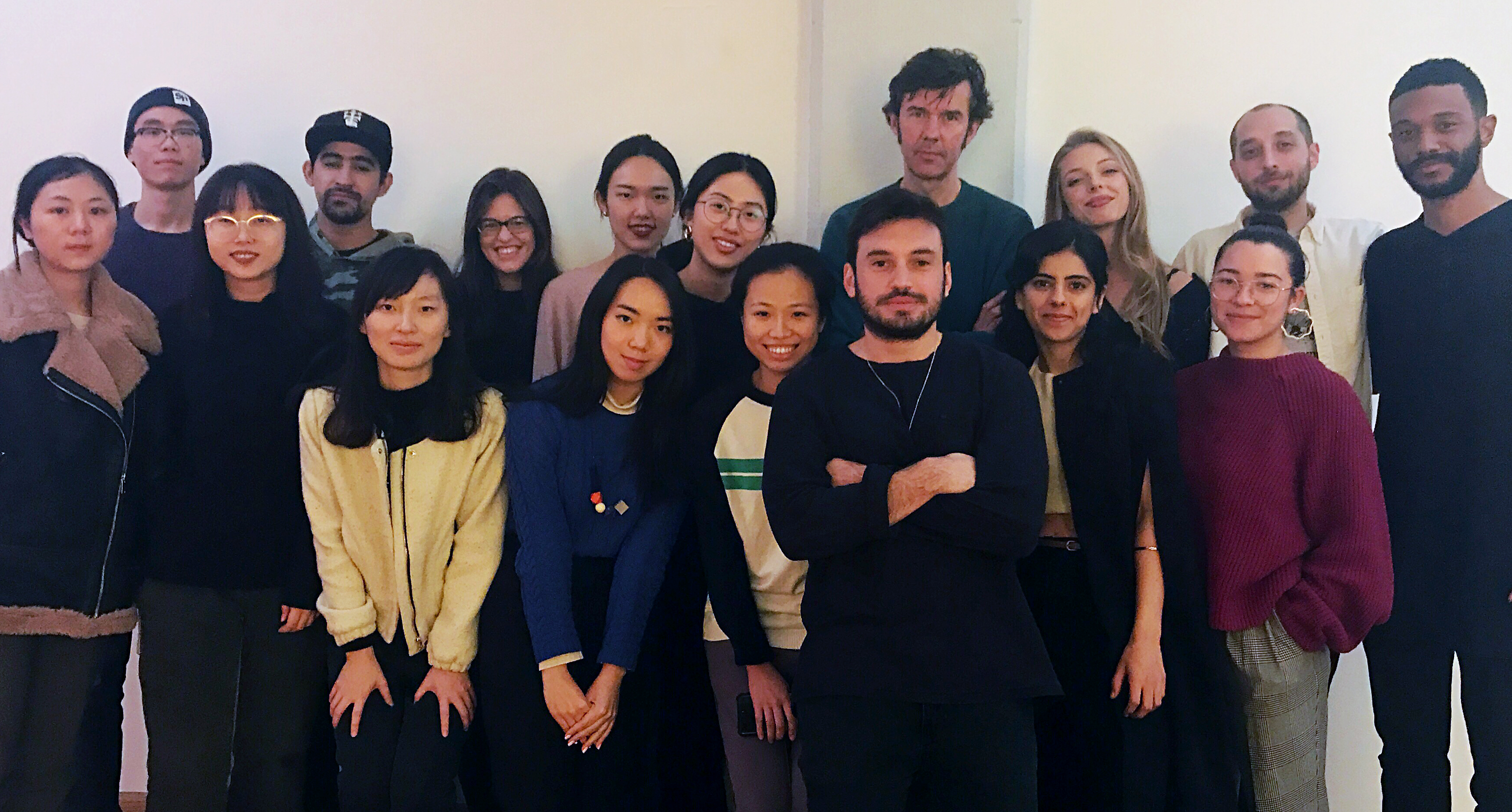
Can design touch a person’s heart? Most certainly. But how, and to what extent? That was for us to explore in our first semester with the infamous, illustrious, Stefan Sagmeister.
With his course, Sagmeister instilled the sense that our design work should actually function and emotionally move people in the real world. He divided the semester into three projects. The first assignment was to touch a stranger’s heart with design, and the results were quite varied. Yuxin Luo designed an innovative leather cuff for a dog walker to carry his many keys; Tomoka Murakami illustrated gorgeous business cards for a Best Buy employee; Yaxu Han developed a personalized planner for the front desk lady in her apartment (and was forbidden from delivering it per the rules of the complex! A truly cringe-worthy experience); and Pedro Andrade created a personalized 6-pack of Coronas for his favorite pizza man.
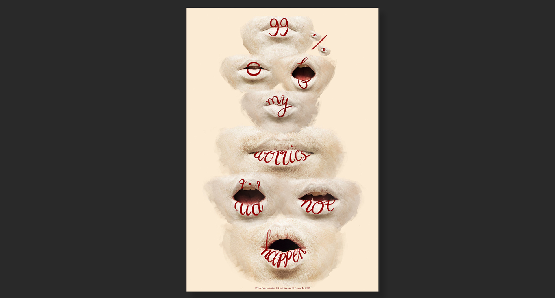
Our second task was to touch a group of people’s hearts with design – this meant anywhere from 50 to 500 people! The scale of the assignment was reflected in our execution; Felipe Oliveira made a magnificent motor-controlled car which chased early-morning joggers with a message of inspiration; Mike Enten made an 8-foot tall thumbs-up sign which he used to wave at commuters in Eastern Parkway; Jiayue Li illustrated dozens of portraits for strangers in Times Square; and I installed a gigantic typographical structure in front of the NY Public Library, and filled the letterforms with hundreds of boxes of feminine hygiene products for passersby to take for free!
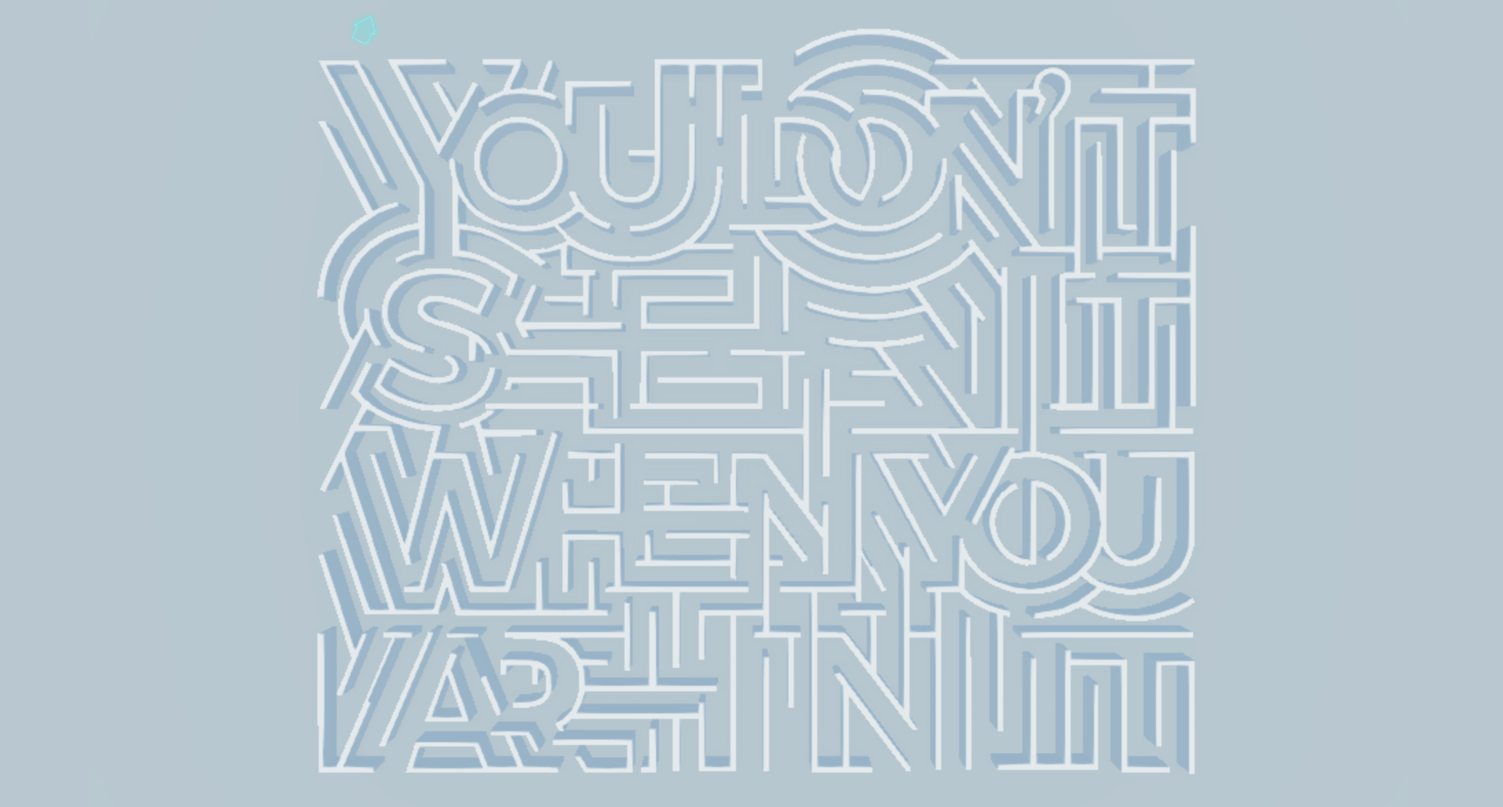
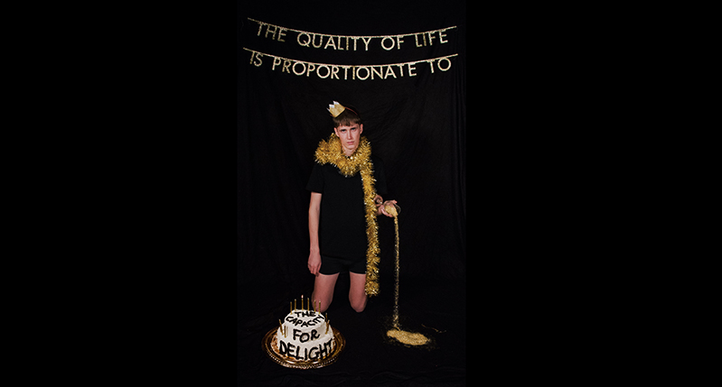
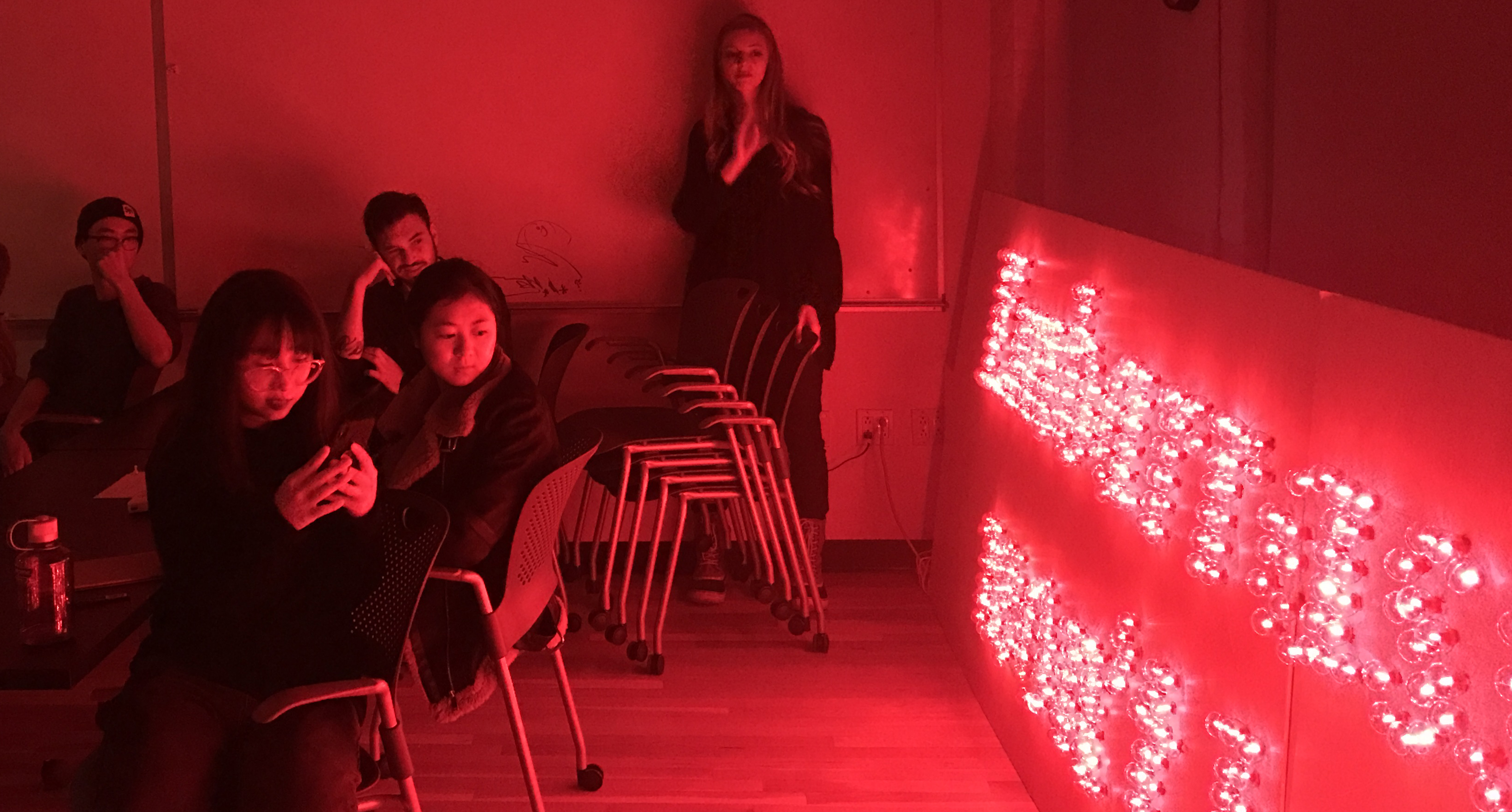
The third and final project encouraged us to reflect on a thing we’d learned in our lives so far. We could represent a thought or phrase in whichever way we wished, similar to Sagmeister’s own elaborate installations (e.g. the penny installation in Amsterdam) or otherwise. This was a fantastic opportunity to play! Mia Rexaach scrawled her phrase a thousand times on her body, covering herself from head to toe; Emily Wack created a 16-foot long light installation which glowed red (and suffered injuries in the process of making it), Akansha Kukreja photographed a second-year student in his boxers with a two-tiered cake and golden glitter; Liz Xiong designed a meditative app where lettering took the form of a maze…the list of fascinating projects goes on!
More often than not, Sagmeister’s reviews of our work weighed heavily on how beautiful, or not beautiful, they were. In fact, this was one of the greatest perspectives we gained from the class. To him, the big idea of a project is less important than its form. Form, he reiterated to us over and over again, is crucial to the success of good design.
Needless to say, this course offered us many opportunities for exploration, not just in terms of creating highly involved projects, but also the self-development that occurs when you’re attempting to impress one of the most iconic designers on the planet. Moving into next semester, I know each of us is looking forward to using our newfound perspectives to touch many more hearts.

