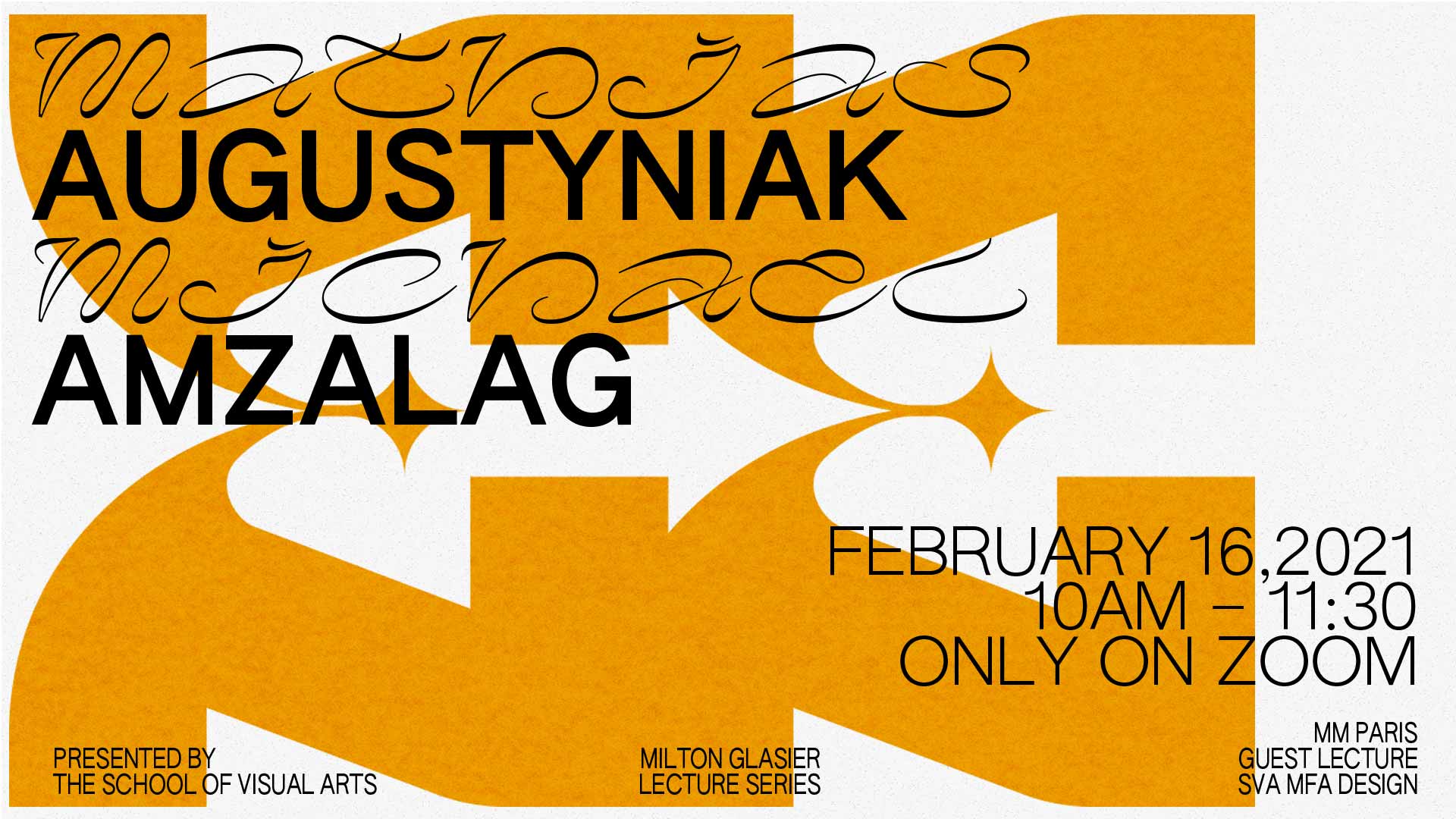
Guest Lecture: m/m
Emily Roemer
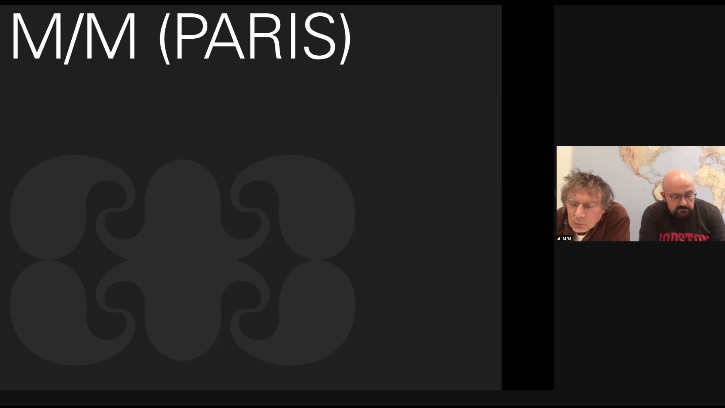
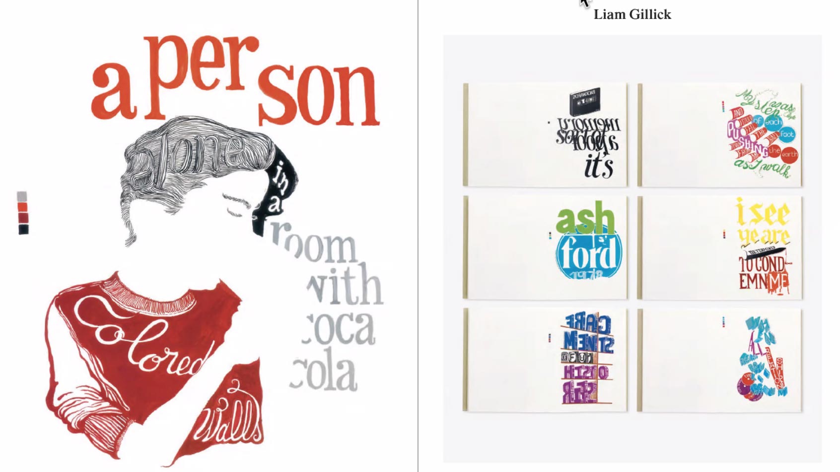
m/m (paris) is an agency by Mathias Augustyniak and Michael Amzalag. We had the privilege of speaking with them on their design philosophies on Tuesday. They sent us an amazing — and beautiful — book of their work. They discussed how putting your work within a book is a very difficult exercise but from the looks of the book, they make it look easy. With a body of work as captivating and original as theirs, the book translates into a piece of art.
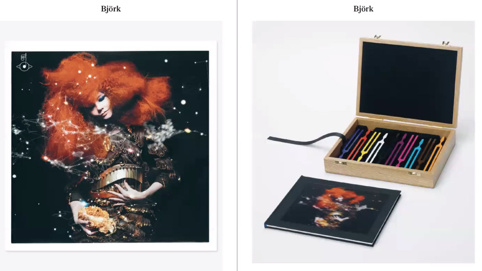
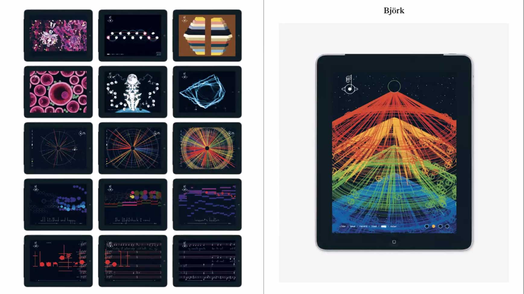
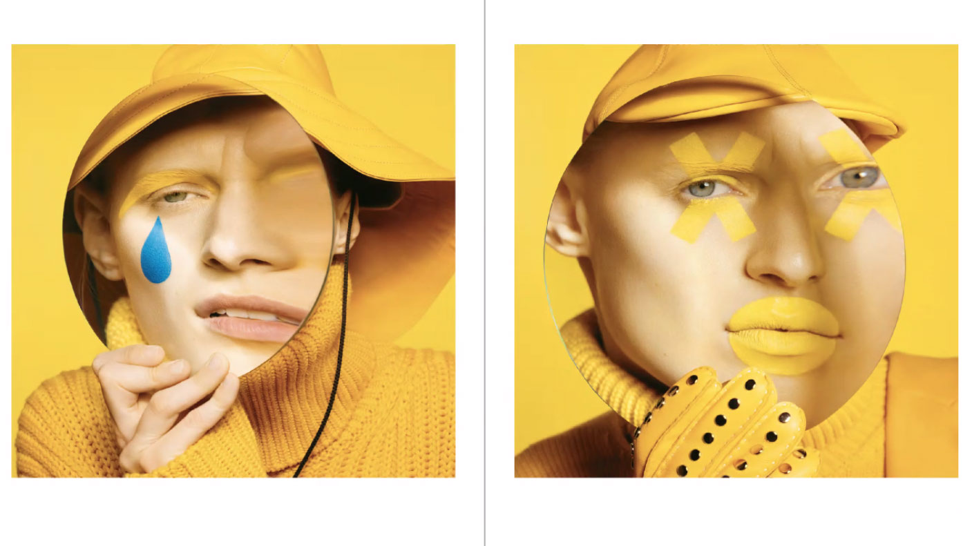
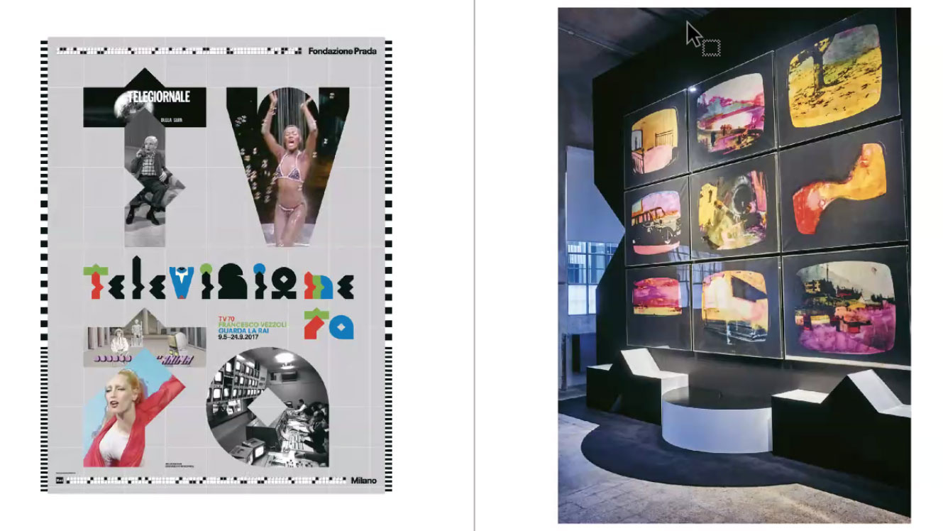
I have always been a fan of the work m/m has put out into the world, and if you are a designer or not, you have defiantly seen at least one of their projects in the ‘wild’. A few of my favorites include the experimental work done for Prada, their hand drawn type that is exciting and organic, and their work for perfumery Byredo. Notably the geometric typeface Byredo uses is one of my all time favorites.
They also discussed how they are trained graphic designers and typographers but always declared themselves to be artists, “we are artists operating in the design field.” I love the idea of that, the expression of art and design morphing into one. When you look at their work you can certainly grasp that idea as they use a lot of hand drawn elements and experiment with different mediums rather than the traditional graphic design agency. They even commented that, “We try to push things so far that people question why this project even exists” and that “we find it hard to articulate all the work we have been doing.”
They also discussed their name : m/m. While it is obvious that both of their names start with M — Mathias and Micheal, they also were inspired by the idea of ‘entering into the alphabet in the middle’ and how they look at things from different perspectives. I love the conceptual nature of that.
Advice they gave to us as young designers : “You can’t expect the right project to come around. Sometimes you’re lucky but you want to fight for the projects you want to do.” Fight for the projects you love! We are so grateful to spend the afternoon chatting with these inspiring people, we feel very lucky to have gotten the chance to meet with them virtually and hope to get to meet them in real life one day.
Thank you so much m/m, we loved your insights and conversation.