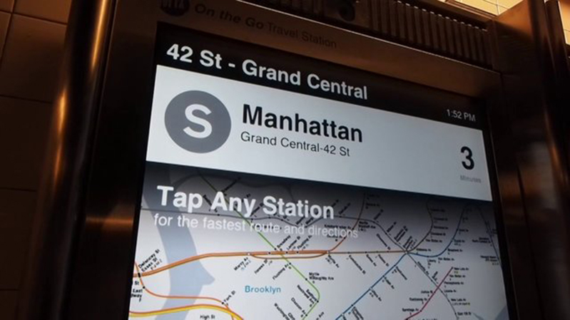
Hester and the Touch Screens
Photo from Gizmodo
No, its not a rock group. Josh Hester (MFAD ’08), a Design Technologist at Control Group, was involved with the early visual and experience design and implementation that inspired the final design of the Transit Touch Screens. Since then, he has lent his critical eye and production skills in refinement of the design. Here he talks about the new NYC entry to the digital world.
“The early design was implemented as a fully working interactive prototype on the kiosk, which we then tested extensively internally with coworkers and outside clients and visitors to the office. Coming out of that testing, we applied those lessons to a more complete design, revising what didn’t work and keeping what did. Most of the core elements established in those early designs remained through to the final design.
One core element established early on was the idea of making the map the ‘hero’; by using the map as the primary navigation, we minimized the barrier between the user interface and the rider tasks. Another was the concept of the ‘private vs. public’ space; a single rider can engage with the kiosk directly, while other riders walking by can quickly find out other information.’
Another was the establishment of three core rider groups; everyday commuters, off-routine commuters, and tourists. Everyday commuters don’t need routing help but want to know train arrivals, so that information was placed in the upper “public” area, able be seen from further away. Off-routine commuters need to find a new route to a place they’re not familiar, so they can engage with the map directly to discover. Tourists may not be familiar with the map at all, but they have ideas of where they want to go. We did early designs to allow them to browse points of interest throughout the five boroughs. At the moment, this remains as a future feature.”

