Italian Vernacular Typography in Rome with Louise Fili
By Farrah Berrou
“Fare la coda” or the inability to stand in line is not the only thing that Rome and Beirut have in common. Much like my own home city, Rome has a tangible warmth to it and I’m not just talking about the temperature. There is history here that can be seen in the ochre tones of the buildings, heard in the undulations of the language, and even tasted in every scoop of black raspberry gelato. When it comes to design, it’s as if things look the way they’re supposed to without much thought put into it. As our first lecturer, Louise Fili, said, “in Italy, everything is beautifully designed even though no one is a designer.”
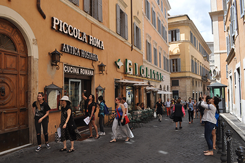
She walks us through 35 years worth of her carefully curated collection of signage. Not only is Italy the birthplace of Latin typography, it seems it’s also where every sign has a lineage. Rather than reading a plaque or pocketbook guide, each sign forms a graphic timeline because the style of type used corresponds to a particular historic era. Leave it to graphic designers to learn about history via type, right?
But oddly enough, it works. Not only does Louise tell us about each sign’s historical significance but also how the style of signage can tell you what part of Italy you’re in. It seems that each part – be it Florence, Bolognia, Rome, or Torino – has its own flavor and trademark when it comes to their storefronts.
What I find most interesting is the businesses that the signs represent tend to belong to a family that has been in that business for generations. The symbol becomes representative of part of their legacy, not just indicative of what they’re selling thus becoming a visual landmark in that neighborhood’s collective memory. It reminds you that there’s a story behind every sign and all you have to do to find out more is walk through the doorway underneath it.
Photo captions:
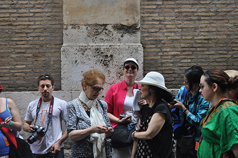
The signage tour through the city and Louise talks to the owner of Ristorante Settimo about their signage from the 1960s.x


