Ladislav Sutnar-Inspired Typfaces Part 1
Nov 04 2019
Here are the first four selections by the Class of 2021:
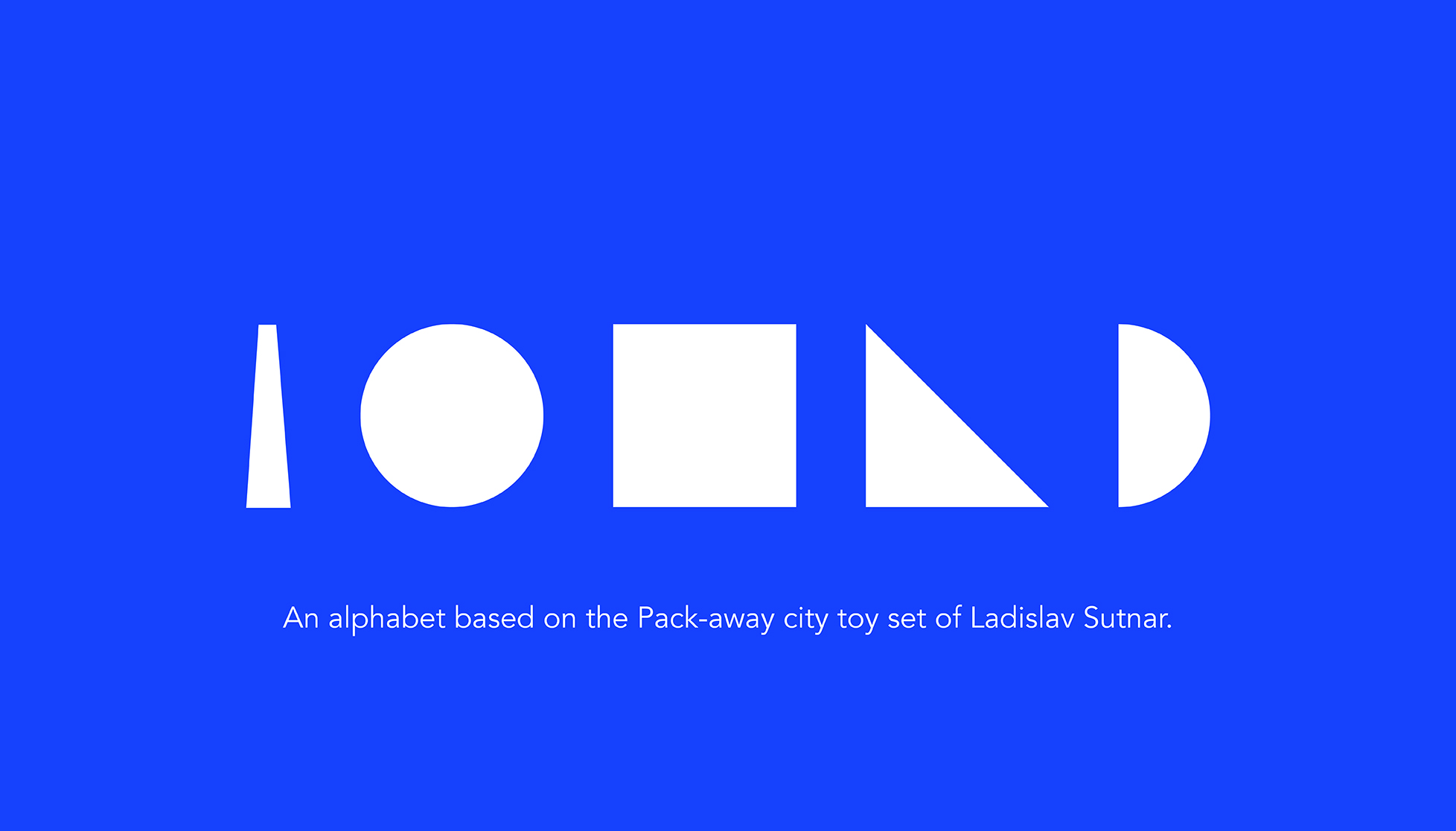
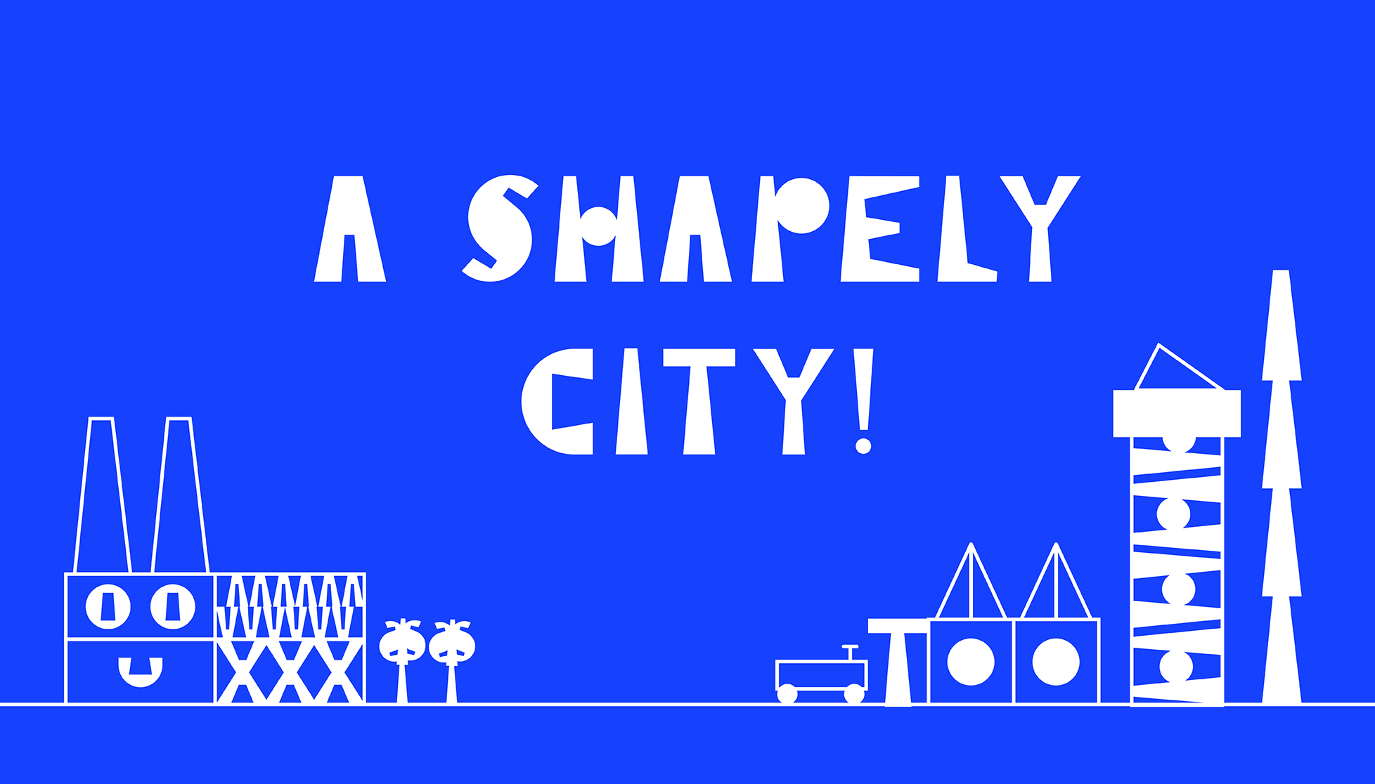
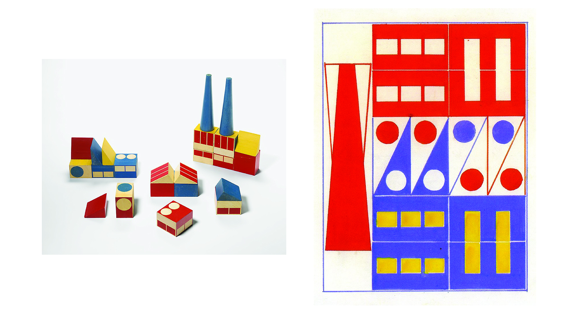
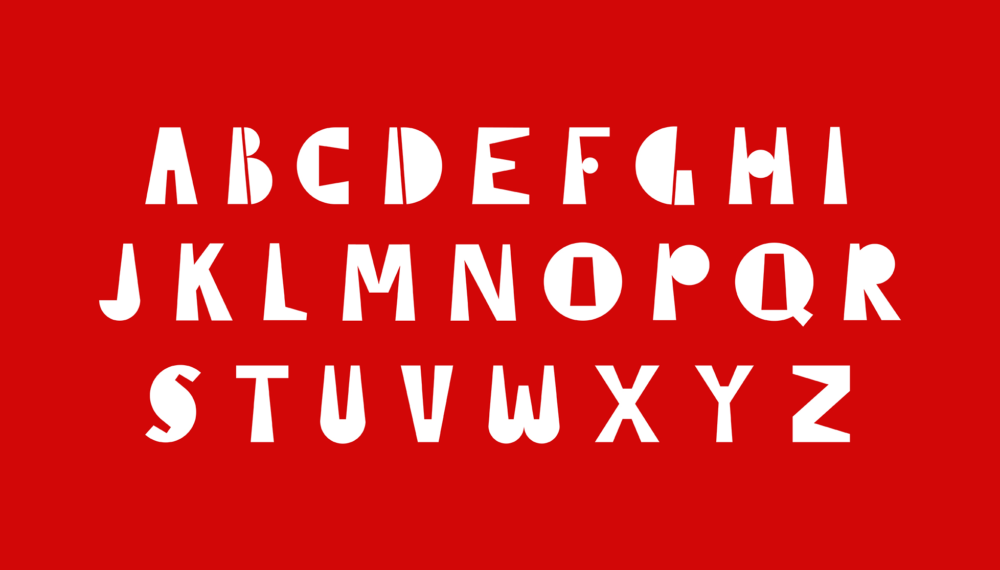
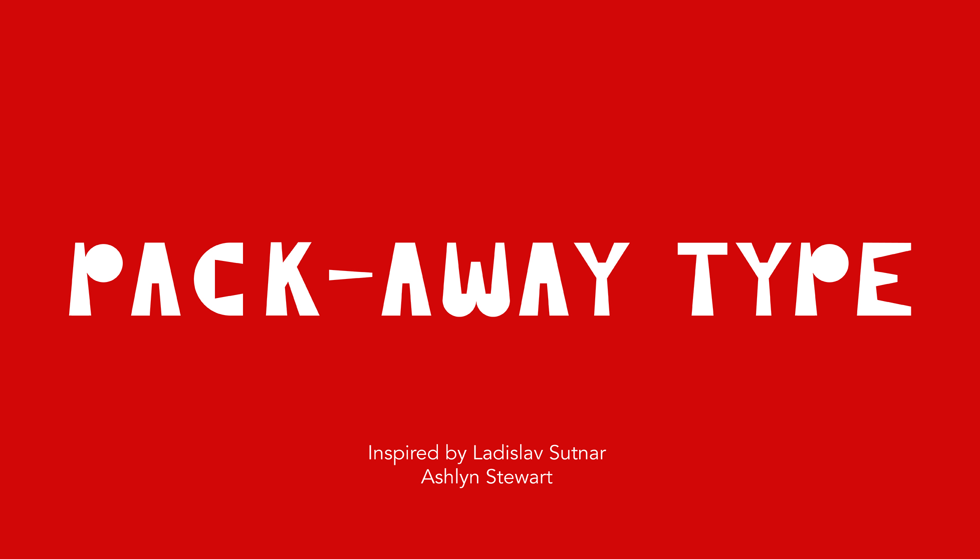
- Ashlyn Stewart draws inspiration from Sutnar’s toy block industrial city. She uses the five primary geometric forms to compose “A Shapely City.”
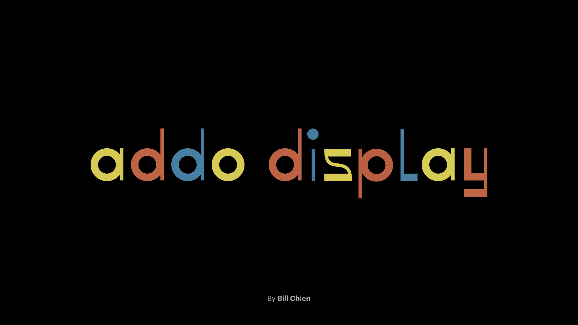
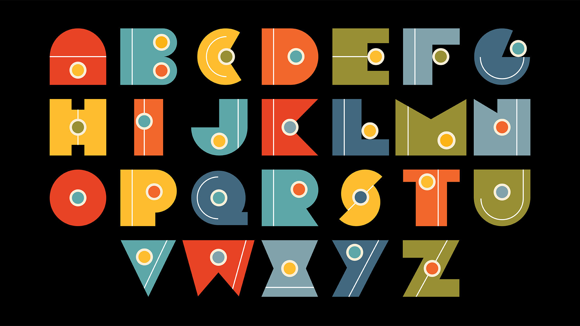
- Bill Chien is influenced by Sutnar’s logo for addo-x, the Swedish business machine company for whom he did the identity and promotion.
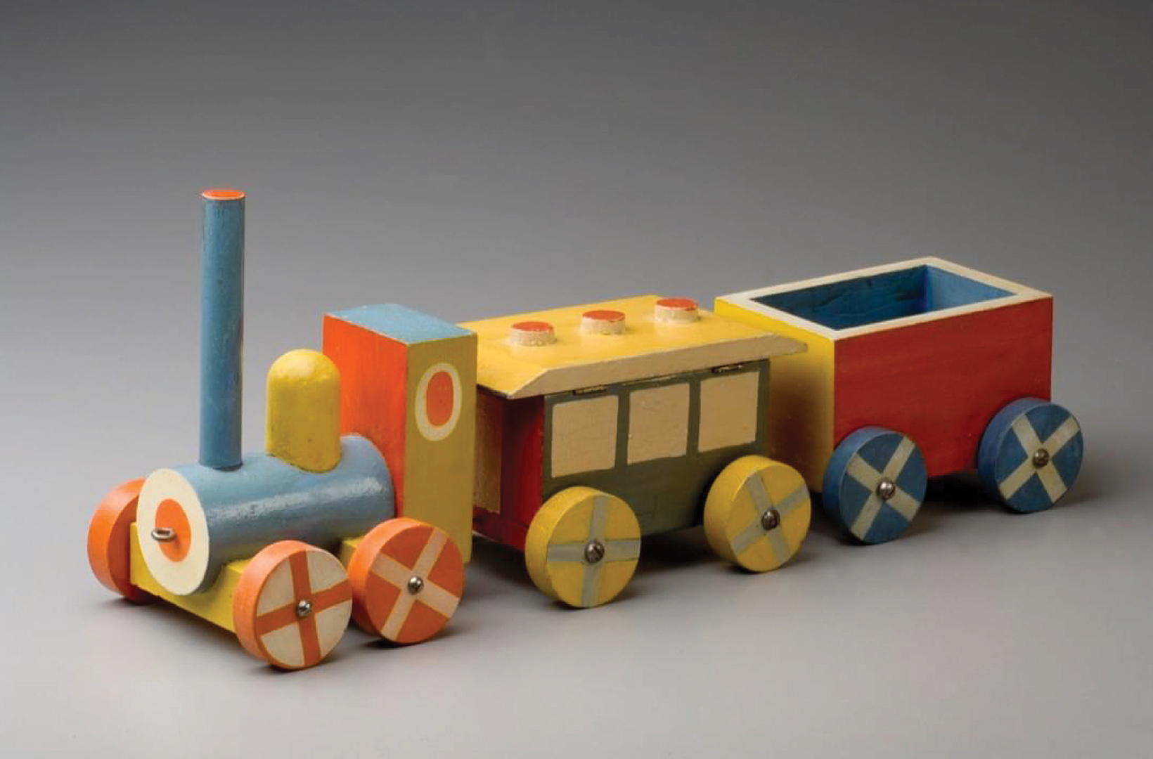
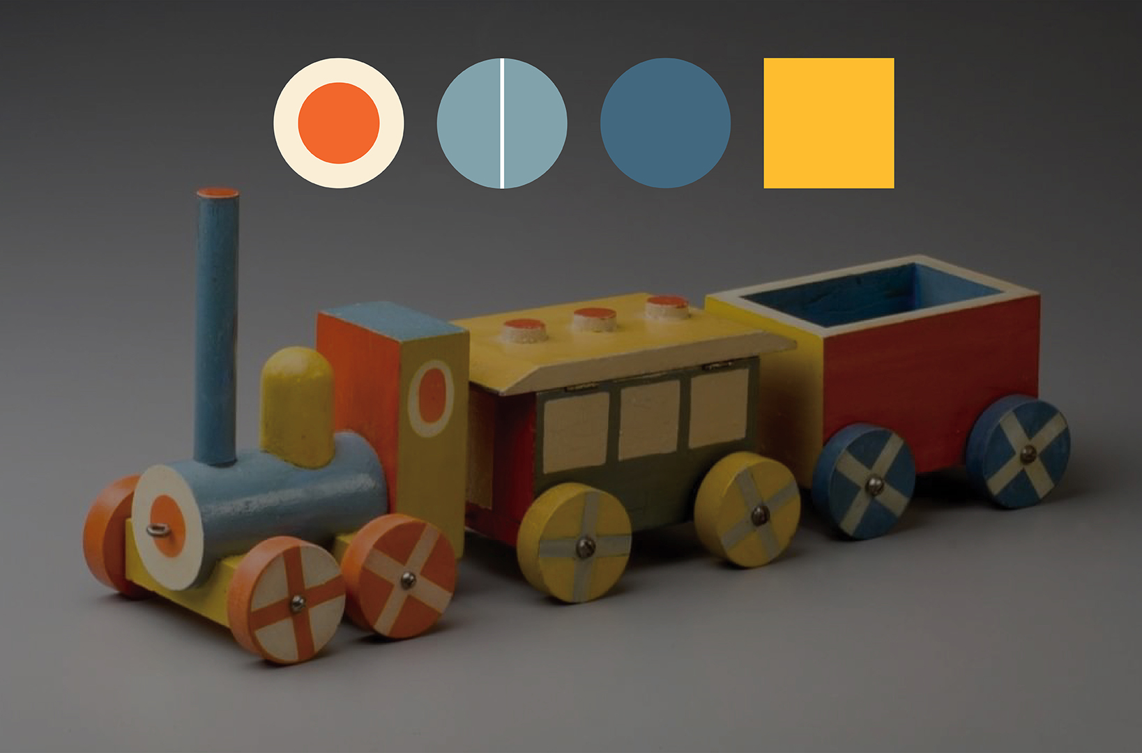
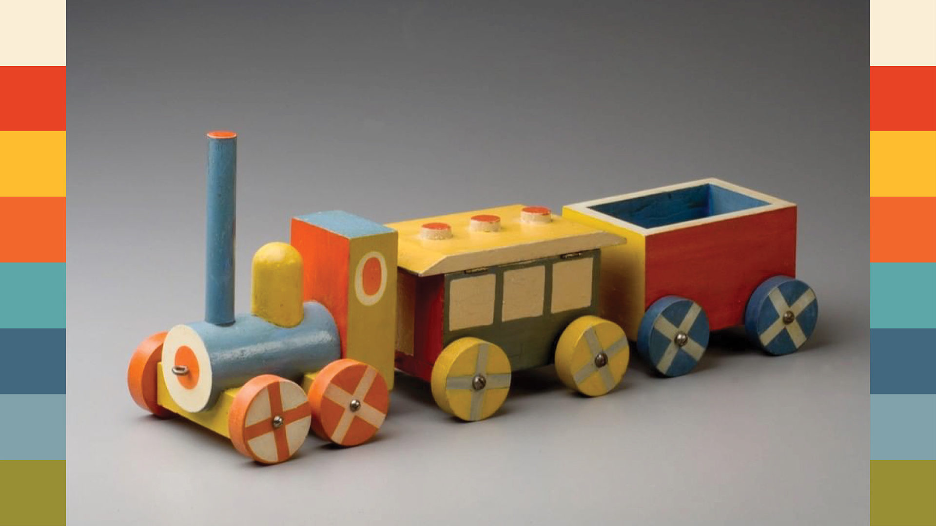
- Eunji Kim took inspiration from another of Sutnar’s famous wooden toys, the train engine.
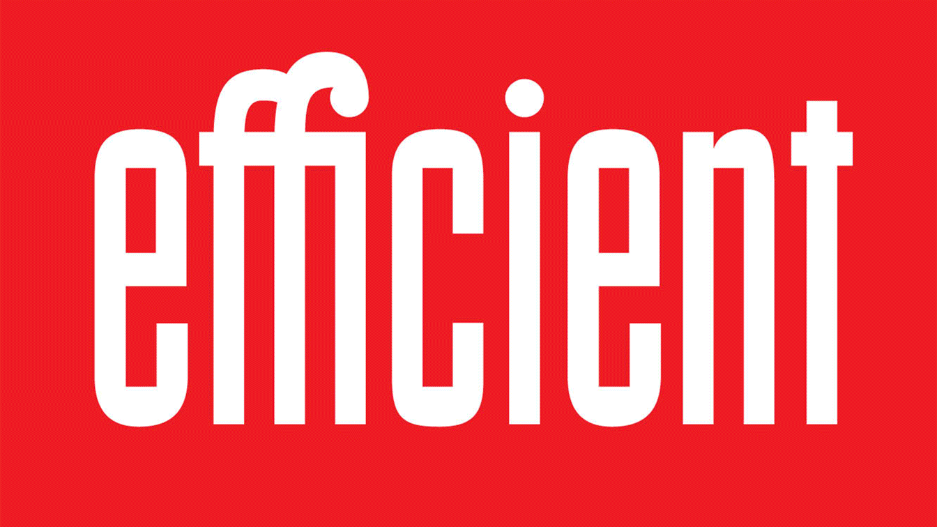
- Jennifer Bowles finds “that Ladislav Sutnar’s fresh and contemporary display typography on the cover of ‘Catalog Design: New Patterns in Product Information’ exemplifies some of the basic elements and principles of design — a strong repeating line, a delightful use of shape, texture, rhythm. Plus, I fancy that the letter forms are based on geometry —a rectangle surrounded by an oval — rather than forms derived from the logic of the hand-drawn letter. With the benefit of his existing letters, I created the full the lowercase alphabet, a second more condensed version, and one ligature. I named this typeface “Efficient” because I imagine that Sutnar—being a very pragmatic designer—may have appreciated it.”