Meet the Class of 2010
Student: Bronson Stamp
This project indicates a spontaneity that is often dismissed or shrugged off by puritans of the creative process. The semester long project didn’t come together for me until a month before the due date and this certainly isn’t one of my “best” designed projects from last year, but it is one my favorites for the way it naturally evolved. The photos were taken in one day, swiftly and with exploration. This was my third concept for the assignment,…etc. It’s funny–and all to normal–how much time we spend in the first three months of a four month project, only to then spend two sleepless days at the very end putting the thing together because the last idea was the best.
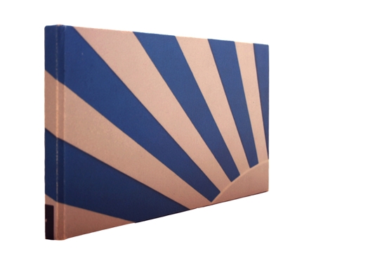
The project embodies what it means to me to be the ultimate creator (or author) of content and design. Self reliance, experimenting and instinct are also nice things that went into the making of this book filled with iconic photos of one of America’s east coast beaches. A series of 10 note cards and a beach bag (not seen) complimented the book to complete the project.
Project: A shrine to contrast
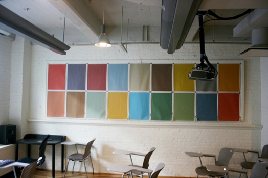
A shrine to contrast; a shrine to newsprint; a shrine to color on newsprint; a shrine to autumn colors on newsprint; a shrine to time; a shrine to spontaneity; a shrine to order; and eventually a shrine to power.
It’s just nice colors on newsprint, but it incited reaction, both immediately for it’s nice color and placement in a classroom we all share, and then again later for being misunderstood for a discarded assignment . And that, as communicators, is one of our essential objectives: to get people to care, react and wonder–and then tear down (which isn’t such a terrible or inappropriate reaction either).


