Meet the Class of 2015: Gilad Foss
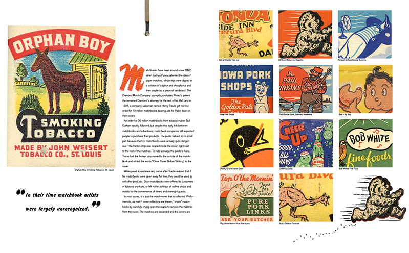
Gilad Foss designed this magazine feature about vintage matchbooks for an editorial design class taught by Robert Best in a Continuing Ed class at SVA NYC last fall. He says that he’s done projects that were more challenging conceptually and technically, “but like the look and feel of this one the most.”
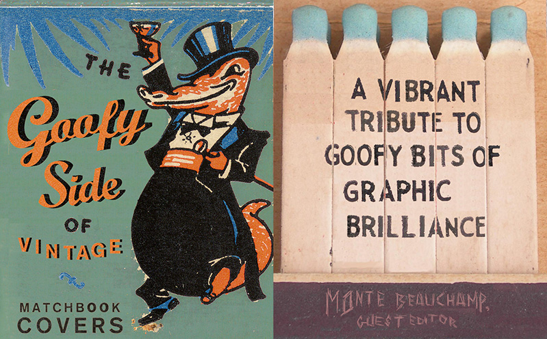
“I’ve been a big fan of vintage matchbooks for a long time: the bright colors, bad color separation, goofy cartoon mascots, and texture of cheap ink and paper always make my ‘design heart’ beat a little faster. I made the type for the subhead and byline myself, and like how their textures neatly play off the matchbook aesthetic. The speedlines behind the waiter, also shown in some of the original matchbooks, and burnt matches at some of the margins, add visual interest to the overall design and mirror the feel of the original artwork. Now that cigarette advertising is largely (and rightly) relegated to the margins of the advertising world in the U.S., I like the subversiveness of showing off these cheap little things that don’t just encourage you to buy something, but light one up while you’re at it.”


