Roma Day 6: Letters of Credit
Photos by Claudia de Almeida and Esther Ro-Schofield
By Claudia de Almeida
We have been in Rome for almost a full week now! After a few days exploring the city, visiting historic sites, museums, monuments, inscriptions, working through the layers of information and history that are so visible (and sometimes not so visible) in this glorious city, we started to put it all together in today’s workshop with James Clough.
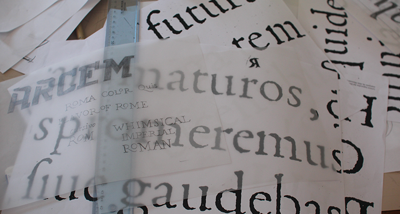
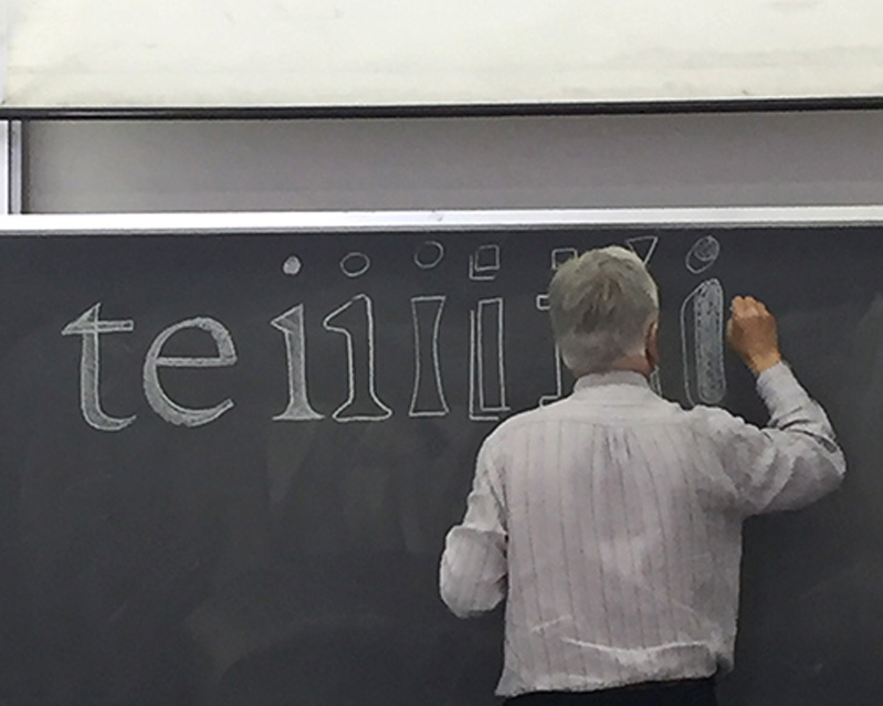
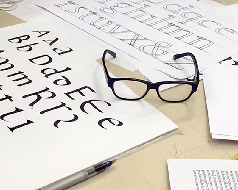
The day started with a lecture revisiting the history of the Latin alphabet. Starting with the Imperial Roman, James turned our attention to the proportion of the classic letter forms: Narrow E, S, and B. Wide N, O and M. We also took notice of specific qualities of the letter forms; the pregnant belly of the B and it’s equivalent soft and delicate top bowl. The elongated and delicate tails of the Q and Rs. Noticing the thicks and thins of the letters and how those strokes are informed by the tool used to draw them: The flat blush! A notion that now is pretty much well received around the world, thanks to Edward Catich, an American sign painter, who upon moving to Rome after joining the Catholic Church as a lay priest, helped demystify the enigma behind these proportionally beautiful letters.
Before Catich’s “The Origin of the Serif: Brush Writing and Roman Letters” the Imperial letters were topic of much fascination and debate. Many calligraphers, calligraphy enthusiasts, architects and scholars tried to make sense of how the letters from Ancient Rome were constructed. James showed Felice Feliciano, Dürer and Luca Pacioli’s attempts to rationalize the letters with geometric and mathematical guidelines, resulting in letters that lack the overall elegance of the Trajan model.
We then turned our attention to the lowercase alphabet, which evolved from our capital letters. The contemporary Latin lowercase letter forms evolved from the carolingian alphabet, but before we landed on the letterf orms we know today, our alphabet made a few more evolutions, including uncial letters and black letter (known as “gothic” by the Italians).
We then explored the work of Poggio and Sanvito, eventually moving from written letters to printed letters. We looked at early printed letters, which were clearly influenced by the calligraphic model, until the arrival of Nicholas Jenson’s beautiful letters. Although these were still heavily influenced by the wedge pen, Jenson’s types were more typographical in form. Moving on from Jenson’s creation we landed on the letters of Aldus Manutius, who not only popularized and developed italic typefaces, is attributed as inventing punctuation.
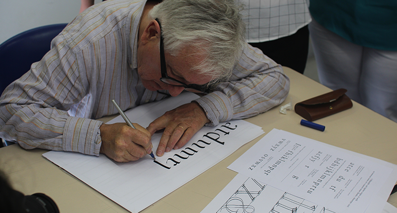
After detailed study of Aldus Manutius (and his punchcutter Francesco Griffo) typefaces, we proceeded to use Aldus’ Bembo (the model for the beloved Garamond) as an example for our lettering projects.
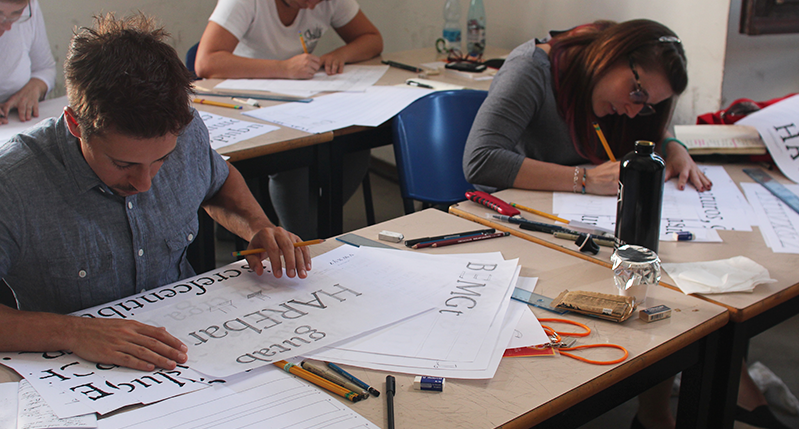
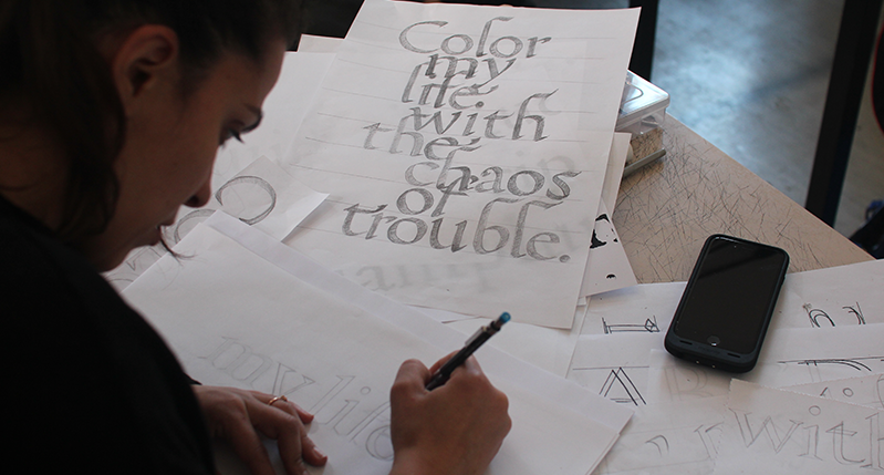
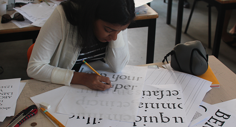
The lettering project involved building on Aldus’ classic model, by making conscious design choices that would make our lettering project unique and homogeneous. James reminded us, not only the importance of understanding letter construction and overall texture of the text (vertical and horizontal spacing) but not to rely on design tricks that will distract from articulating and carrying through our intent. On the spirit of less is more, we learned today the importance of understanding and relying on the centuries of typographic development that came before us.