Roma Day III: Typology And The Landscape of Typography
By Rosemary Rae
”A designer without a sense of history is worth nothing.” — Massimo Vignelli
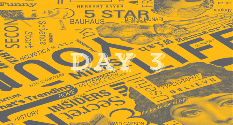
This morning’s lecture by Steven Heller presented lettering, display faces and graphic design. He explained the landscape of typography from early advertising and art display type, through Art Nouveau and Bauhaus, to the computer. Examples of letterpress, stencils and hand drawing were shown, as were movie titles and a television commercial. He condensed 100+ years of typographic history into an engaging, and at times humorous, two hour presentation.
Work by Kurt Schwitters, Fortunato Depero, Phil Gips, Herbert Bayer, Paula Scher, David Carson, P. Scott Makela and Jonny Hannah created an inspiring snapshot of typography’s top influencers and revolutionaries.
I was so inspired by a slide Steve showed of Bruno Munari’s playful type work, I stopped at a bookstore and bought “Alfabetiere.” Also, I am happy to report I now know what a pantograph is and have been officially introduced to Seymour Chwast’s quirky 1970’s typeface, Blimp. Still, I have much to learn!