Rome Day Five: Teaching Type in a Pasta Factory
Text and Photos by Sarah Zimmer
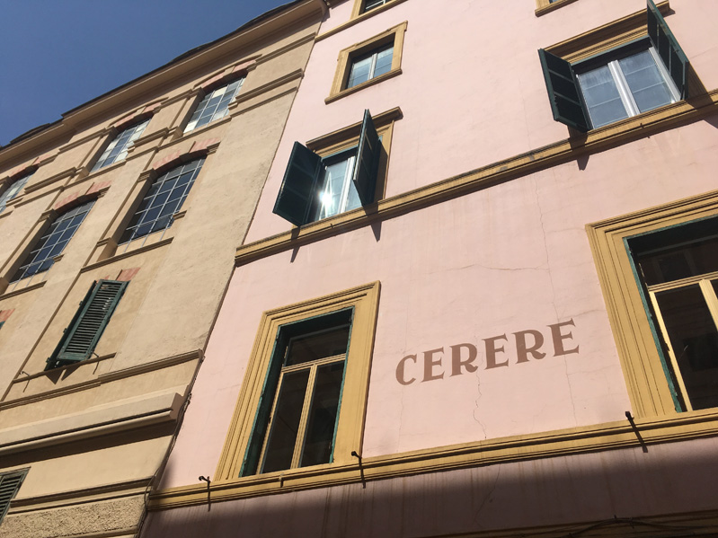
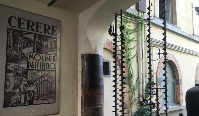
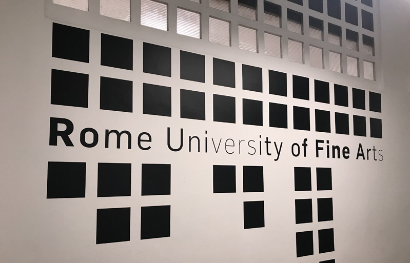
Today we took the bus to the RUFA (Roma University of Fine Arts) building, which once was a pasta factory called Pastificio Cerere.
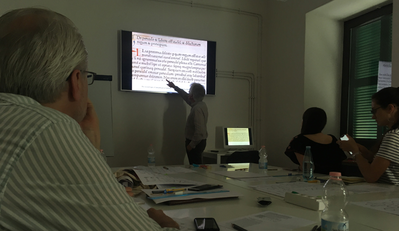
Here James Clough taught us about the evolution of Roman type, the basis for all letterforms. These letterforms that have become completely common to us in modern times were born from the Roman engravings and inscriptions that date back as far as 1st Century BC, as exampled in an inscription dedicated to Gaius Appuleius, located in Museo Romano Aquileia, or the headstone of Epaphroditus in the Garden of Museo Nazionale.
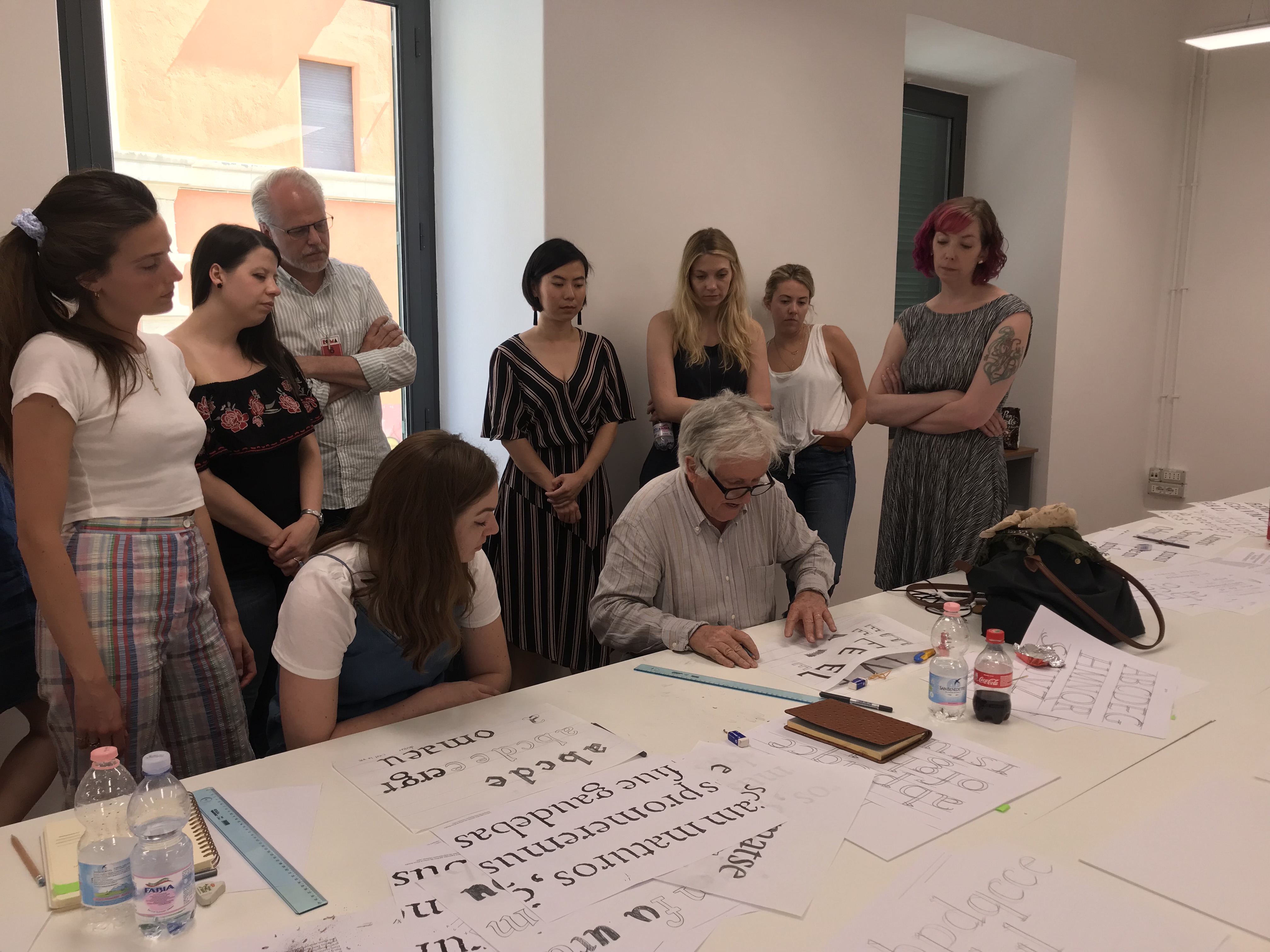
We began by looking at Florentine letterforms and made note of the capital letters, their serifs and sthe lowercase letters that have “exit strokes”, evidence of the calligraphic style in which they were made.
We learned many names that are important to the history of Roman type: Sweynheym and Pannartz, Ulrich Haan, Nicolas Jenson, Aldus Manutius, Felice Feliciano, Luca Pacioli, Claude Garamont, the Da Spira brothers, who in 1469 created the “first clear example of Roman type” and so many more. We also learned that while the Romans of the 15th century had many abbreviations, the only one we still use today is the ampersand, &, which is short for “et”.
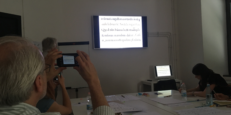
An important name I don’t know that I’d heard before is Francesco Griffo, who cut type for Aldus Manutius, and can be credited for defining the beautiful letterforms we now know. Claude Garamont based his now-infamous typeface Garamond on the forms that Griffo cut for Manutius. This side-by-side of both shows just how similar they are:
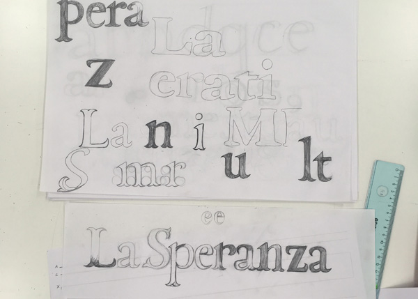
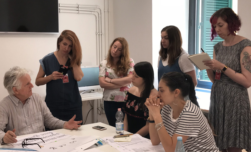
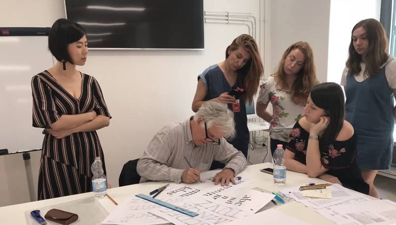
After James’s lecture we drew letters with two pencils bound together to reproduce the effects of the thicks and thins in Roman type. James showed us how to use enlarged printouts of the examples we had just studied to more closely learn the proportions of this Renaissance type, and then we were encouraged to experiment and come up with our own variations.
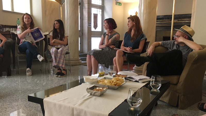
Following class, we took the bus back to our hotel and each of us declared to the group what we have planned for our final project. We were able to discuss it in detail and iron out any elements that didn’t quite work. Though we’ve been to the same lectures, museums and sites for the whole program thus far, we were all inspired by very different aspects of Rome and have each come up with unique project ideas. Immediately following the project declaration meeting, we were anxious to get started, so after a quick trip out for pizza and art supplies, I ended my day in my room sketching and researching. I’m looking forward to tomorrow, day 2 of James Clough’s workshop where we’ll finish up our uniquely lettered phrases, applying what we’ve learned today. Ciao!