Stuck on MFA Design
By Emily Roemer
For the MFA Design branding this year, Ezra Lee and I were asked to team up and create an identity that expresses what this program stands for. We tackled this both conceptually and aesthetically with our core tag line being, “Think. Make. Do.” These words felt especially true after spending a year in the program and really learning and understanding how much time and effort goes into every project. As designers we do a lot of thinking and sketching, we then make and iterate, and finally we do. And by do, I mean we take our design out into the world and make positive change or impact.
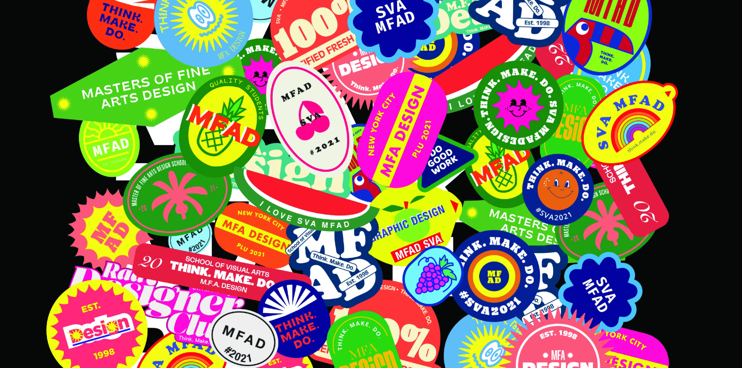
For our branding we wanted to create something ephemeral that highlighted the strength and resilience of graphic design, but most specifically, our MFA Design program. Our goal was to do something exciting and eye catching that would look great on print items as well as animated on screens. We landed on the idea of making fruit stickers because of how small yet significant they are. Apart from being really cute, fruit stickers tell us the origin of the fruit, give stores important batch information, and often times have personalized illustrations. While making our “MFAD Fruit Stickers” we wanted to add personality and flair to each of them. Every single sticker is unique and different, when you put them all together on a poster or booklet cover, they look even stronger — and since we are back in person after a year of online school, we are all together again feeling stronger than ever. The stickers and their differing design aesthetics, typography, and colors represent our diverse MFA Design program with our students being from different countries, backgrounds, and specialties. We are celebrating that sense of collaboration.
Stay tuned for animations of our branding on Instagram @svamfadesign, and if you are around the studio, be sure to ask us for some physical stickers, what’s better?