The Helvetica Spirit
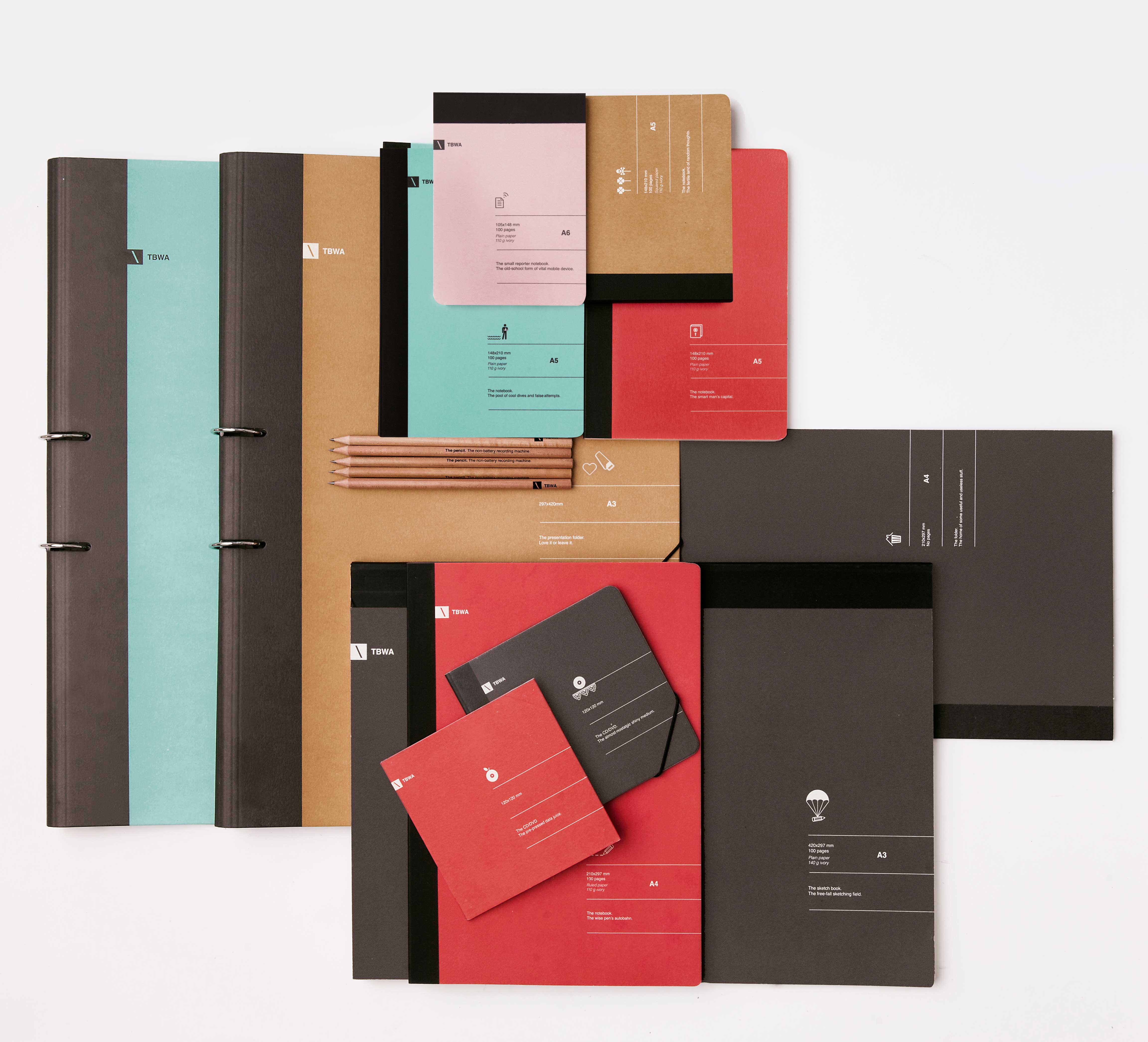
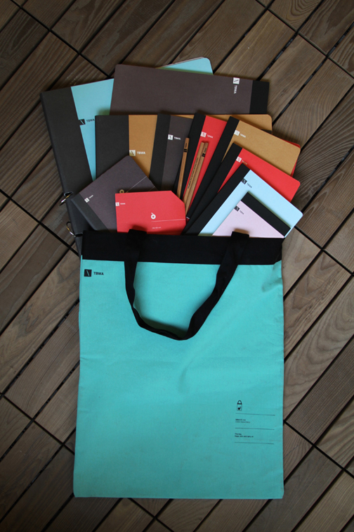
Zeynep Orbay (MFAD 08) helped TBWA in Turkey globally change it’s corporate typography to Helvetica by redesigning all of their stationery items.
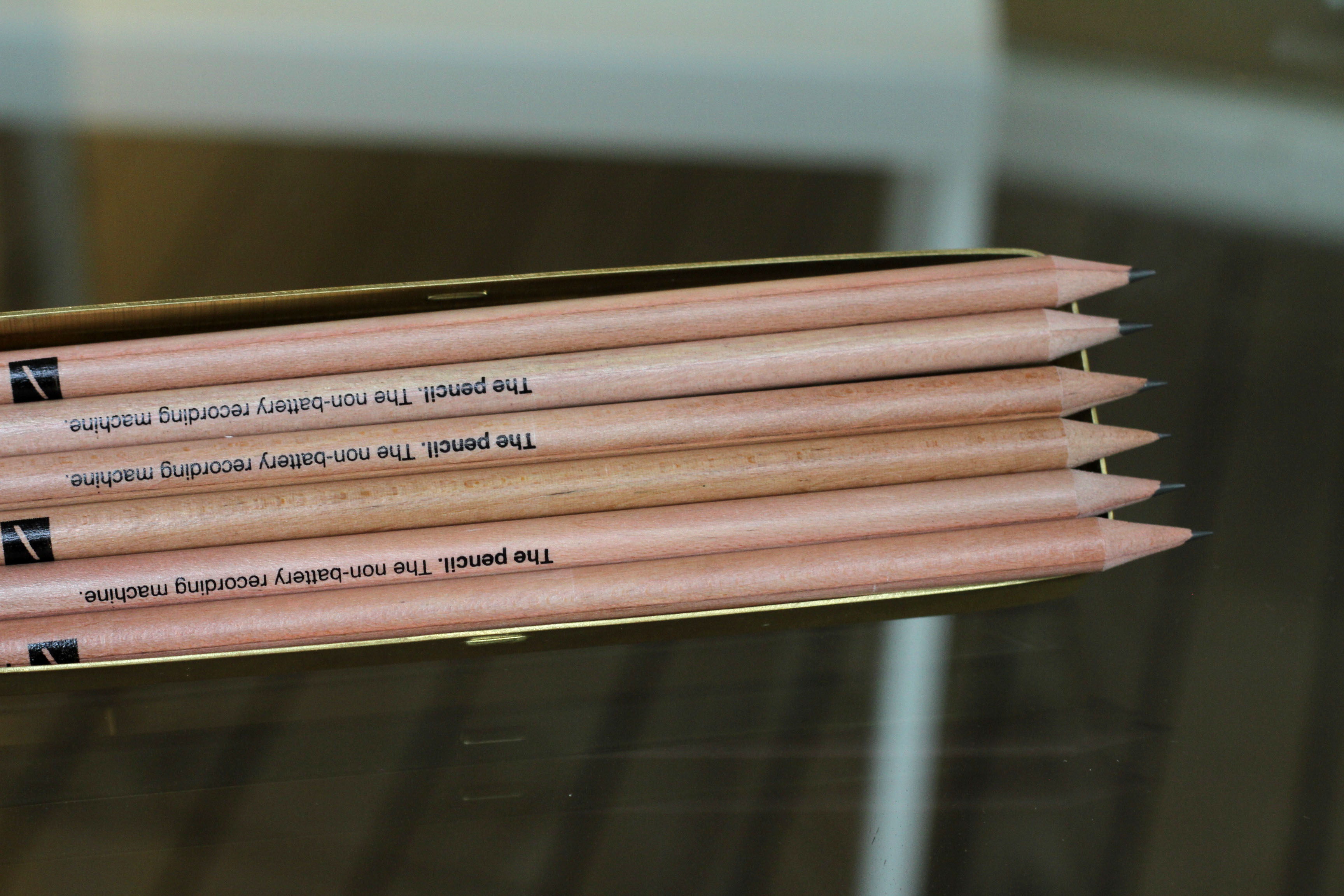
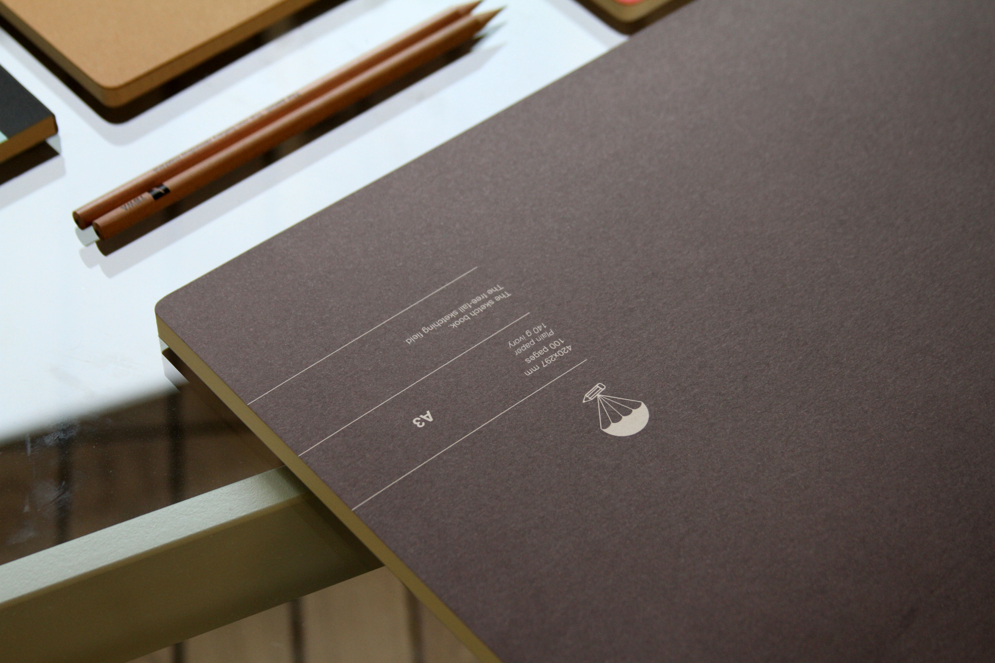
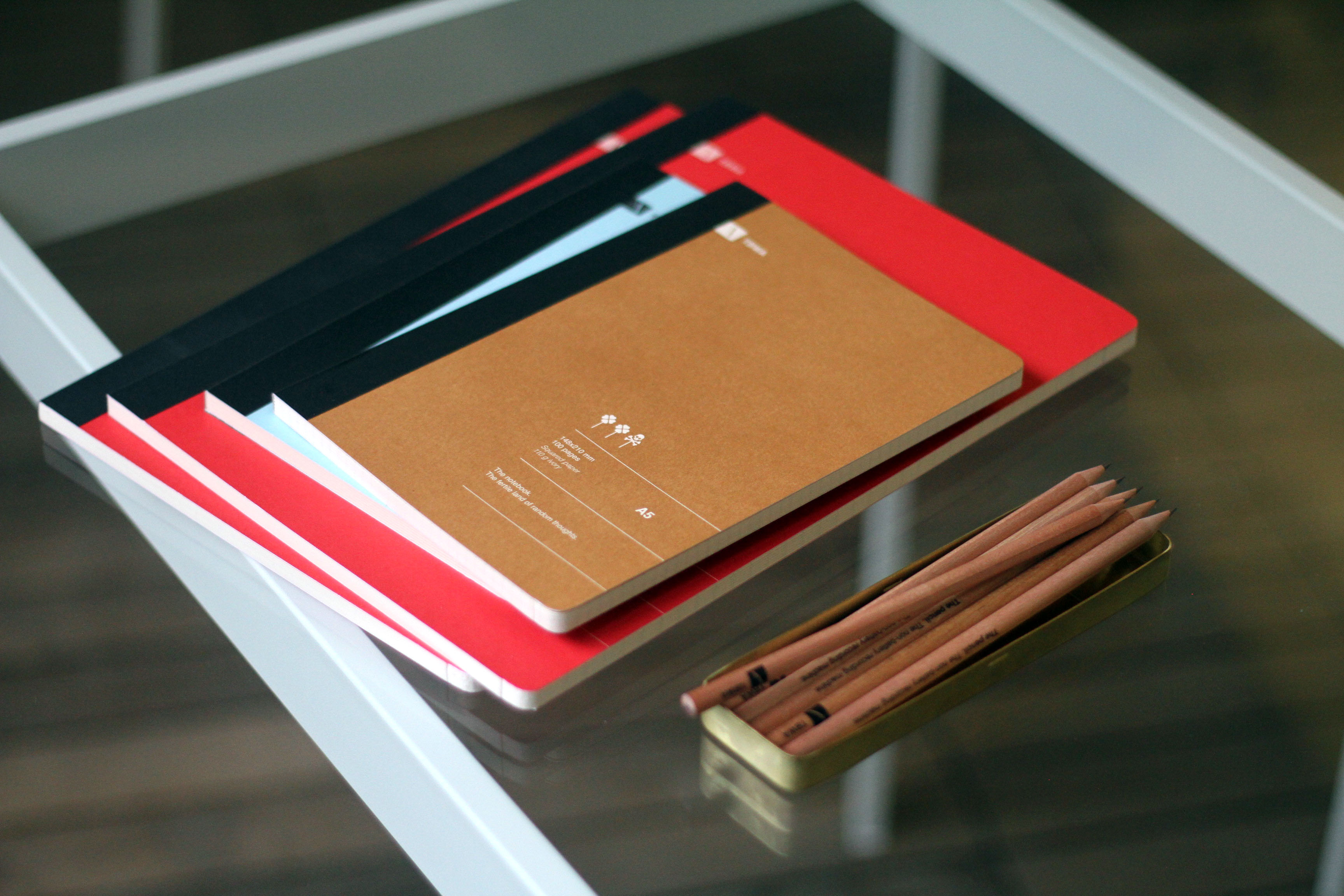
“Stemming out of the Helvetica spirit we wanted them to look as Swiss as possible,” she explains. “Everything is stated and specified perfectly in the general Swiss way of packaging. All the precise info about the size, weight or materials take place directly on the packaging itself.
We did the same. But of course, we made some little tricks and added some wit-spice disrupting the specifications and the rigid Swiss-design. For each item a sentence and an odd icon is created referring to the meaning of that item in our lives.
The design understanding is intentionally kept subtle letting users discover each idea as they use these items on a long term basis.
The stationary won many awards including the Grand Prix in Golden Drum Awards and a design shortlist in Cannes Lions International Advertising Festival.”