
When Beauty Speaks Quietly
By Fernando Capeto
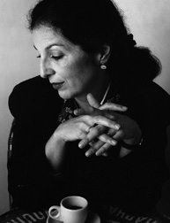
Last Thursday was definitely not a regular day. Among all the projects and tasks, that we as students in SVA’s MFA Design program have to do, one event was truly unique. Uniqueness alone is not enough to describe the experience of visiting the studio of Louise Fili, who after designing more than 2,000 book covers, opened her own firm specializing in design for restaurants, food packaging and books, including her own.
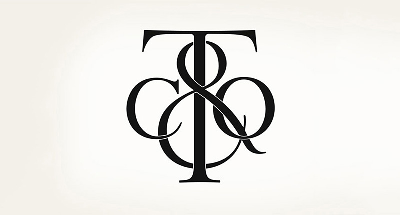
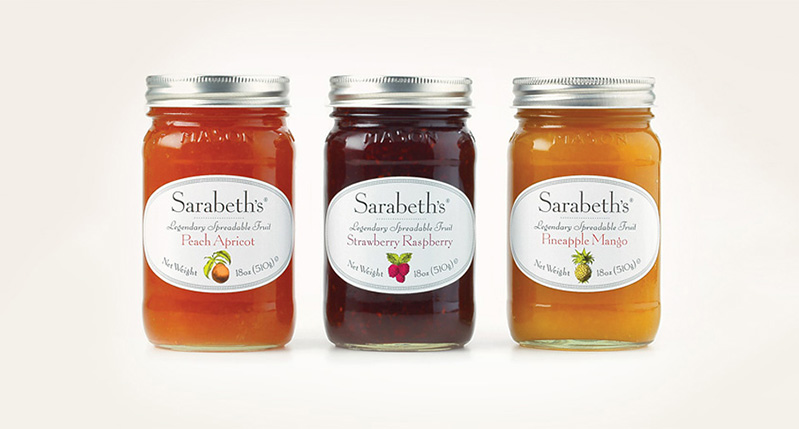
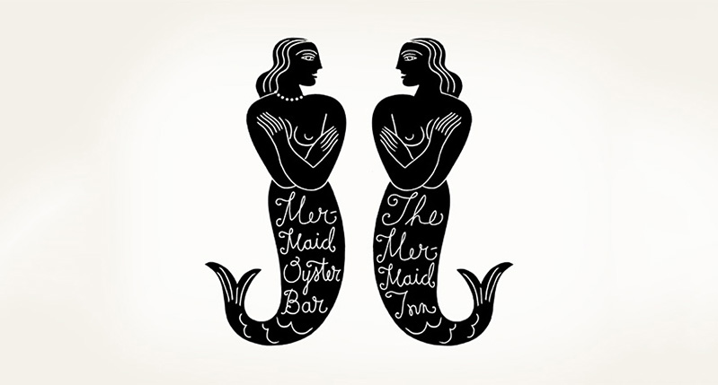
As soon as I walked in Louise’s studio I felt different. Escaping the chaotic and noisy streets of New York, it seems that I have entered an oasis: calm, quiet, full of charm and beauty. You feel that you are in a special place. Her passion for design history and historical typography reflects the studio environment filled with vintage ephemera sharing space with her own work, that itself is a wonderful fusion of contemporary design with an antique aroma.
The students were amazed when Louise, Elegantissima, entered the room and began giving her lecture. She presented us with some of her most stunning work in a peaceful, delicate but powerful tone of voice, which defines her own style and approach to design.
I could sense that the attention to details echoes in everything she does: from her personal style, to the studio interior, to the books, visual identities and typography she has created. I instantly felt a little off guard. I was expecting a simple lecture but was experiencing an event showcasing beauty, elegance and a mastery of craft. So much so, that I even felt that I should have dressed myself better for the occasion.
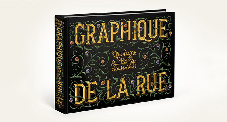
In the final part, Louise presented her amazing books about Italian and French street signages. She then brought up an issue of great concern. A lot of the wonderful, vintage craftsmanship is being replaced by new “owner’s nephew-knows-photoshop” signs. She credited this mainly to the ignorance regarding the history of typography and art.
Being a typography lover like Louise, I really felt like we shared the same sorrow towards this dying craft. The loss of beauty in the streets is a loss for everybody in the community. After all, beauty, in all its forms of expression, evokes the very best in people, inspiring them to have a happier day or even a better life. So thank you Louise for reminding us, through your impeccable and timeless work, that true beauty makes us aware of the most sacred things in life.
*If you want to know more about Louise Fili’s work, visit her website.
Post by Fernando Capeto, 1st year student at SVA MFA Design.