Workshop Day 4: Type From Scratch with James Clough
By Heather Moulder
Before I left for Rome, at the last minute, I quickly packed Tipoteca Italiana’s “Alphabets of Wood” as a bit of inspiration for class. Imagine my surprise when I realized that one of the authors of the book was in fact today’s guest lecturer– James Clough.
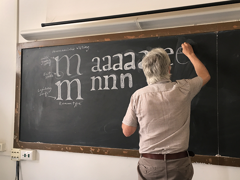
Rather than the 19th century wood type displayed in his book, today James took us down to the bones of it all. Beginning with the chiseled inscription at the base of Trajan’s column, and working through to the punchcutting of metal type for the Roman letter as we know it, we learned about how typography evolved through both stylistic preference and the tools used to create it.
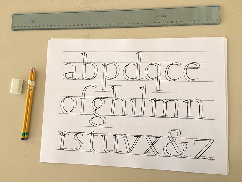
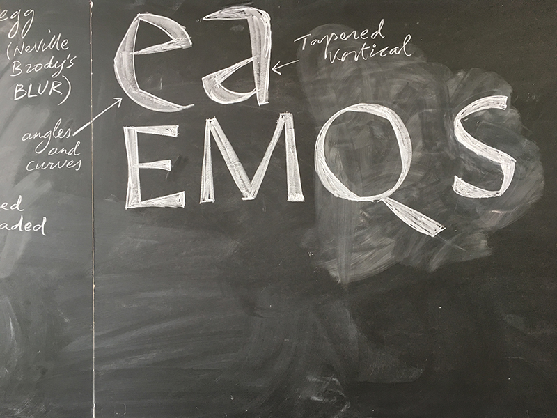
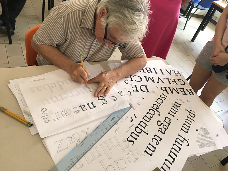
While the particular structures of the Roman letter were rationalized in many ways– math, science, the supernatural– today we stuck with Edward Catich’s theory of letters being laid out first with a flat brush, then chiseled in stone. To replicate, we used a couple pencils banded together to practice drawing classical Roman letterforms, all while learning how these letters came to be. Illustrated today by the winding history of the lowercase ‘g’, there were often several stages of evolution between uppercase and lowercase.
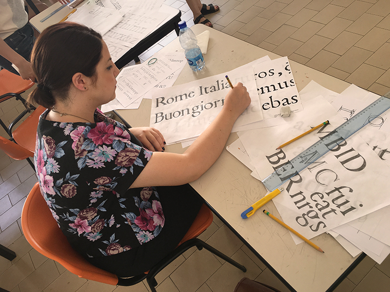
Following some by-the-book replication of letterforms, we had quite some time to experiment with alternative ways of drawing letters using those same proportions. We tried curved serifs, pointed serifs, no serifs, angular strokes– all to create less typical, but often eerily familiar results.
While for many this style of lettering is just a standard method of delivery at this point, working with it this closely really helped me to develop a sense of how serifs work, how type structure affects readability, and how to properly construct these letters in the first place. After a few hours of modifying this single type style, it became clear where so many typefaces I love (whether they’re made of pixels, stone, or wood) draw inspiration– it just took slowing down enough to draw them by hand to make some of those connections. As James stated today, “A 3B pencil is a marvelous instrument.”